


Creating Graphs
Plot Options
Plots have lots of options for labeling. To use the plot options, you add them to the basic plot command separated by commas. Here are some common plot options.
main="Main Title"
ylab = "Y-axis label"
xlab="X-axis label "
ylim = c(lower, upper)
xlim = c(lower, upper)
names=c("label1", "label2" [,... "labelx"])
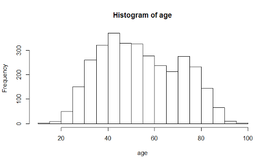
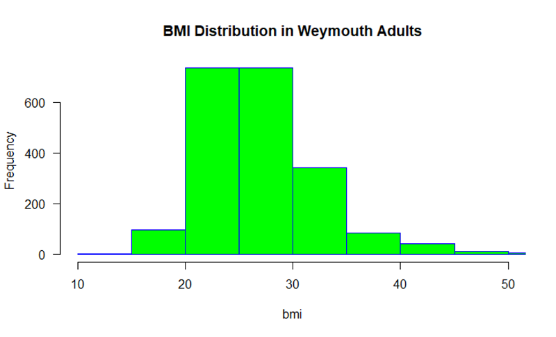
Histogram
hist(varname)
Creates a histogram for a continuously distributed variable.
hist(age, main = "Age Distribution of Weymouth Adults", xlab = "Age")
hist (bmi, main="BMI Distribution in Weymouth Adults",
xlab = "BMI", border="blue", col="green", xlim=c(10,50,
las=1, breaks=8)
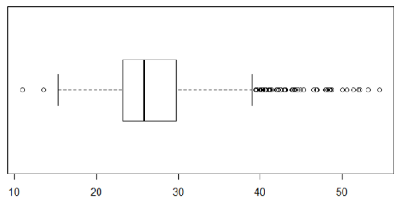
Boxplot
boxplot(varname)
Creates a boxplot for a continuously distributed variable.
The code below gives it a title and a label for the Y-axis
boxplot (bmi, main = "BMI Distribution in Weymouth Adults", ylab = "BMI")
boxplot(bmi, horizontal = TRUE)
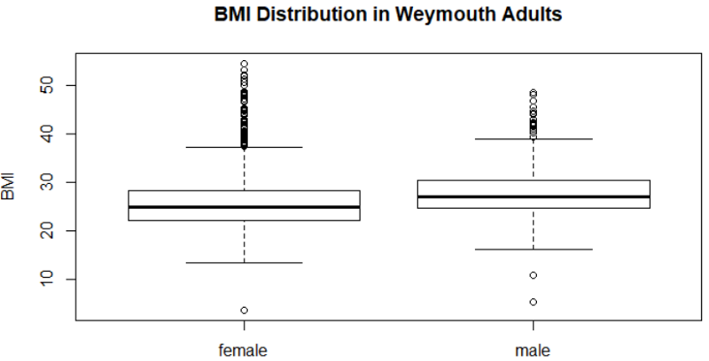
Boxplots by group
boxplot(varname~groupname)
Creates a boxplot of varname for each groupname.
boxplot(bmi~gender, main="BMI Distribution in Weymouth Adults", ylab = "BMI")
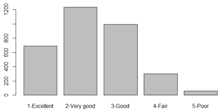
Barplot
barplot(table(varname))
Creates a barplot of frequencies by varname
table(gen_health)
barplot(table(gen_health))
Side-by-Side Bar Plots
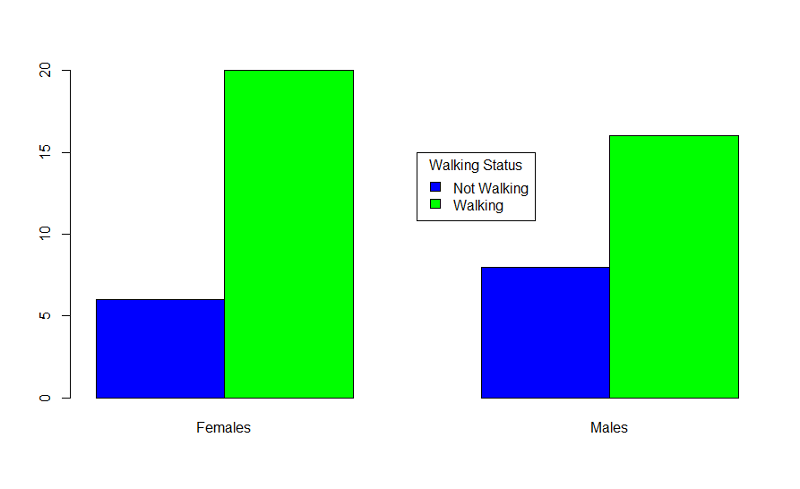
Example: Producing grouped bar charts for whether an infant could walk by 1 year of age (outcome) stratified by sex (exposure).
"Sexmale" was coded as "1" for males and "0" for females. The dichotomous outcome, "By1year", is an indicator variable, where "1" indicated that the infant could walk by 1 year and "0" indicated that the infant could not walk by 1 year.
> barplot(table(By1year,Sexmale),beside=TRUE,
names=c("Females","Males"),col=c("blue","green"))
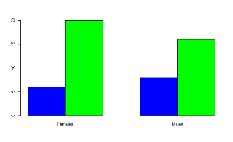
In the table statement, the first variable is the outcome plotted on the y axis, the exposure is the second variable. If you want to add a legend, you could use the following code:
> barplot(table(By1year,Sexmale),beside=TRUE,
names=c("Females","Males"),col=c("blue","green"))
> legend(x=3.5,y=15,legend=c("Not Walking","Walking"),fill=c("blue","green"),
title="Walking Status")
More on Bar Plots
Bar plots should ideally just show the proportion of individual who have a dichotomous outcome. There is no need to also show the proportion who do not have it. This can be accomplished using the matrix command to create an abbreviated table.
This can be accomplished using the matrix command to create an abbreviated table. The example below uses data from the Framingham Heart Study to create a bar plot comparing the incidence of myocardial infarction or fatal coronary heart disease (mifchd) in diabetics and non-diabetics. We first use the table() and prop.table() commands to get the proportions.
> table(diabetes,mifchd)
mifchd
diabetes 0 1
0 2452 316
1 162 69
> prop.table(table(diabetes,mifchd),1)
mifchd
diabetes 0 1
0 0.8858382 0.1141618
1 0.7012987 0.2987013
The only relevant information is the proportion with the outcome in each exposure group in the second column of the prop.table. Therefore, we create an abbreviated table using the matrix command and placing the incidence in diabetics first.
> mybar<-matrix(c(0.2987,0.1146))
Now we can create the bar plot:
> barplot(mybar, beside=TRUE,ylim = c(0,1), names=c("Diabetics", "Non-diabetics"), ylab="Incidence of MI or FCHD",main = "Incidence of MI or FCHD in Diabetics & Non-diabetics")
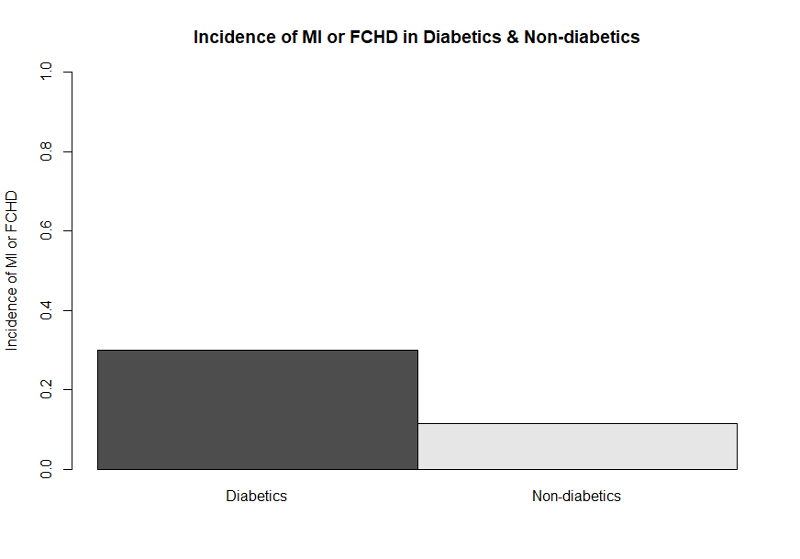
This bar plot is easier to understand without the extraneous bars showing the proportion who did not develop the outcome. Journals generally do not want colored graphs unless it is absolutely necessary. By omitting color designations, the default settings resulted in a black and a gray bar.
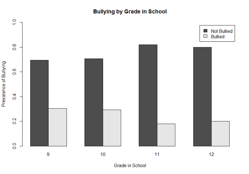
Bar Plot with Multiple Categories
This next example is based on data from the Youth Risk Behavior Surveillance System, a cross-section survey conducted periodically by the Center for Disease Control. This survey asked high school students about whether they had been bullied in school or online and whether they had contemplated or attempted suicide. The graph below illustrates the prevalence of any bullying (anyB) by grade in high school.
First, we get the counts of bullying by grade and then use prop.table() to get the proportions (prevalence).
> table(anyB,grade)
grade
anyB 9 10 11 12
0 169 176 225 187
1 74 73 49 47
> prop.table(table(anyB,grade),2)
grade
anyB 9 10 11 12
0 0.6954733 0.7068273 0.8211679 0.7991453
1 0.3045267 0.2931727 0.1788321 0.2008547
Next we create the bar plot with a legend. The range of the Y-axis has been set to 0 to 1, and we have also provided labels for the X- and Y-axes, a legend, and a main title.
> barplot(gradetable,beside=TRUE, xlab= "Grade in School", ylab= "Prevalence of Bullying", ylim = c(0,1),legend=c("Not Bullied","Bullied"), main="Bullying by Grade in School" )
This illustrates the use of a legend, but, again, the graph would be improved by eliminating the bars that show the prevalence of NOT being bullied. We can once again achieve that by using the matrix command to create a table with only the proportions of those who were bullied as shown below.
> gradetable2<-matrix(c(0.304,0.293,0.17,0.20))
> barplot(gradetable2,beside=TRUE, names=c(9,10,11,12),xlab= "Grade in School", ylab= "Prevalence of Bullying", ylim = c(0,1), main="Bullying by Grade in School")
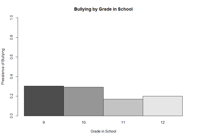
This simpler bar plot more clearly shows that bullying is more prevalent in grades 9 and 10 than it is in the upperclassmen.
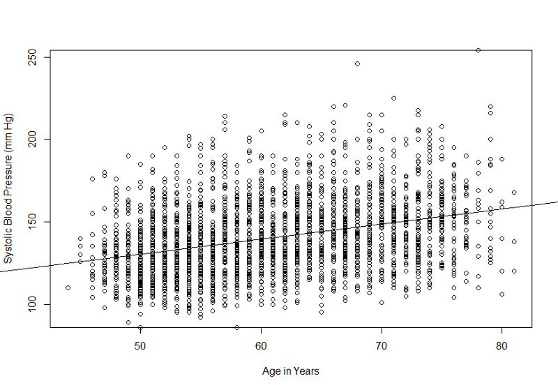
Scatterplots
plot(yvar~xvar)
Creates a plot with a point for each observation for xvar and yvar.
plot(sysbp~age)
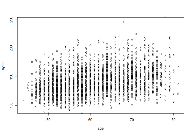
This would be more informative if we ran a simple linear regression and added the "abline()" command after the line of code creating the plot. We should also add more explicit labels for the X- and Y-axes. These improvements are shown below.
> myreg<-lm(sysbp~age)
> plot(sysbp~age, xlab= "Age in Years", ylab="Systolic Blood Pressure (mm Hg)")
> abline(myreg)