


Present Data to Facilitate Comparisons
|
Tips
|
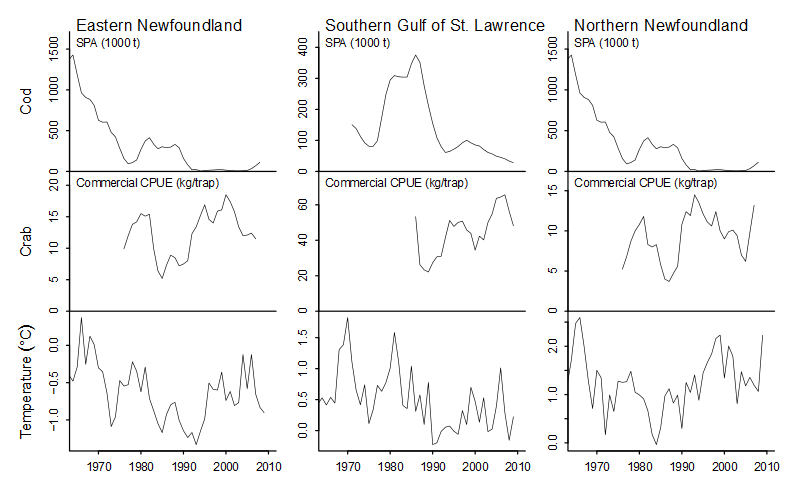
Here is an attempt to compare catches of cod fish and crab across regions and to relate the variation to changes in water temperature. The problem here is that the Y-axes are vastly different, making it hard to sort out what's really going on. Even the Y-axes for temperature are vastly different.
http://seananderson.ca/courses/11-multipanel/multipanel.pdf1
The ability to make comparisons is greatly facilitated by using the same scales for axes, as illustrated below.
Data source: Dawber TR, Meadors GF, Moore FE Jr. Epidemiological approaches to heart disease:
the Framingham Study. Am J Public Health Nations Health. 1951;41(3):279-81. PMID: 14819398
It is also important to avoid distorting the X-axis. Note in the example below that the space between 0.05 to 0.1 is the same as space between 0.1 and 0.2.
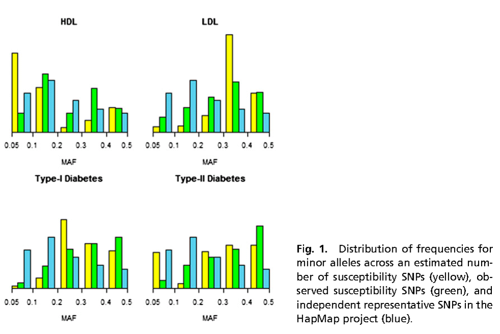
Source: Park JH, Gail MH, Weinberg CR, et al. Distribution of allele frequencies and effect sizes and
their interrelationships for common genetic susceptibility variants. Proc Natl Acad Sci U S A. 2011; 108:18026-31.
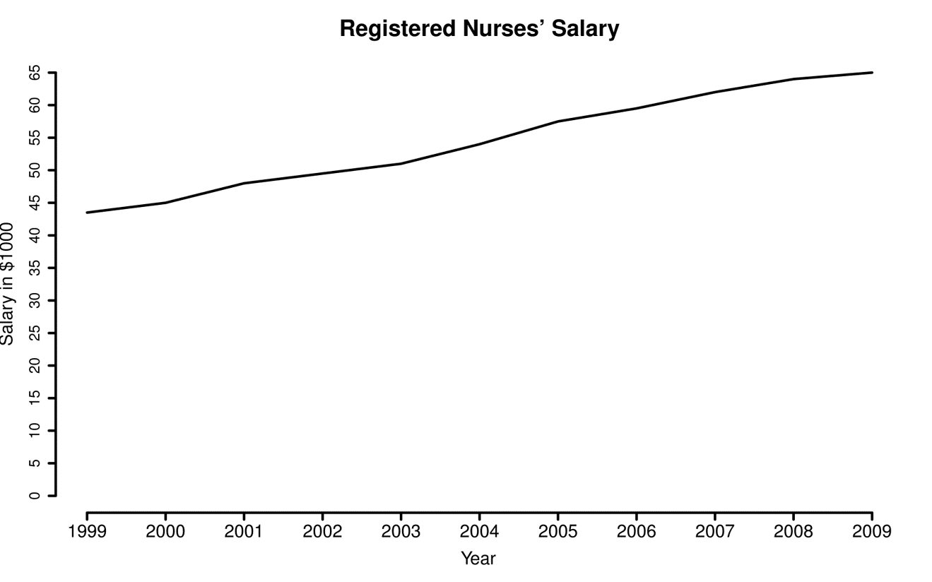
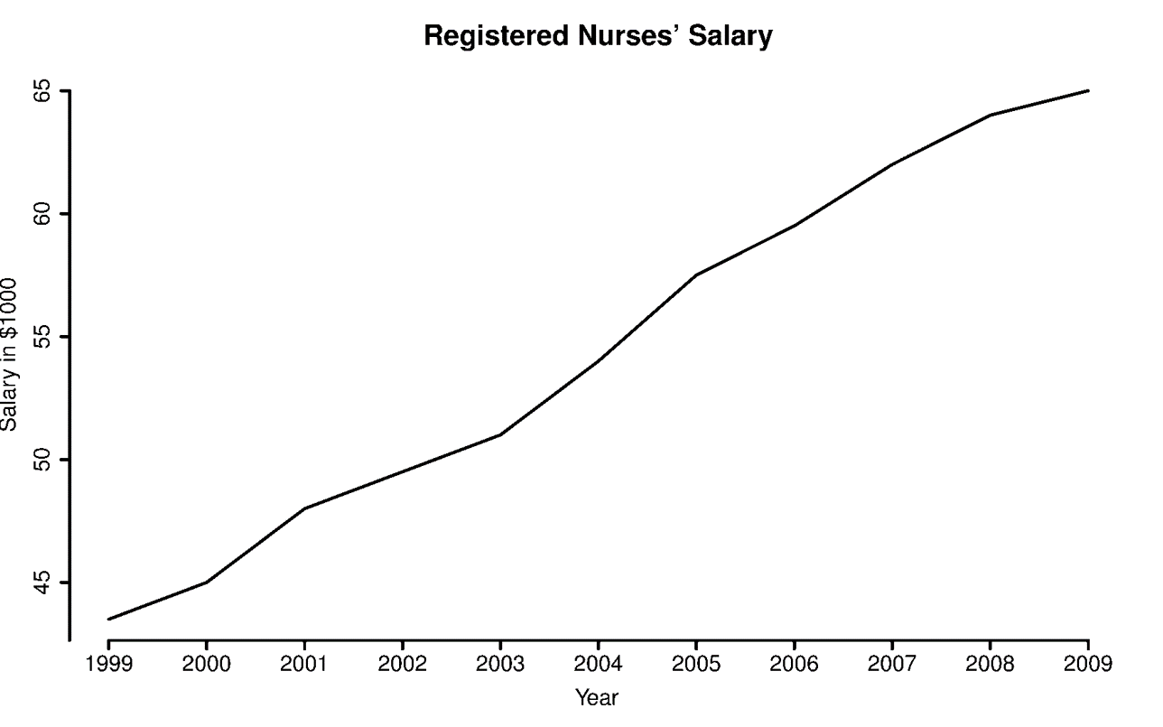
Consider the range of the Y-axis. In the examples below there is no relevant information below $40,000, so it is not necessary to begin the Y-axis at 0. The graph on the right makes more sense.
|
|
|
|
Data from http://www.myplan.com/careers/registered-nurses/salary-29-1111.00.html |
|
Also, consider using a log scale. this can be particularly useful when presenting ratios as in the example below.
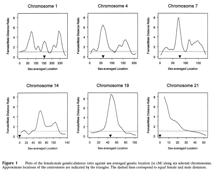
Source: Broman KW, Murray JC, Sheffield VC, White RL, Weber JL (1998) Comprehensive human genetic maps:
Individual and sex-specific variation in recombination. American Journal of Human Genetics 63:861-869, Figure 1
We noted earlier that pie charts make it difficult to see differences within a single pie chart, but this is particularly difficult when data is presented with multiple pie charts, as in the example below.
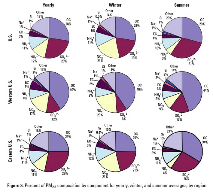
Source: Bell ML, et al. (2007) Spatial and temporal variation in PM2.5 chemical composition in the United States
for health effects studies. Environmental Health Perspectives 115:989-995, Figure 3
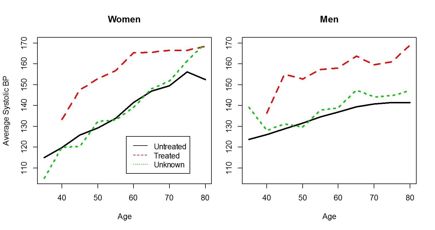
When multiple comparisons are being made, it is essential to use colors and symbols in a consistent way, as in this example.
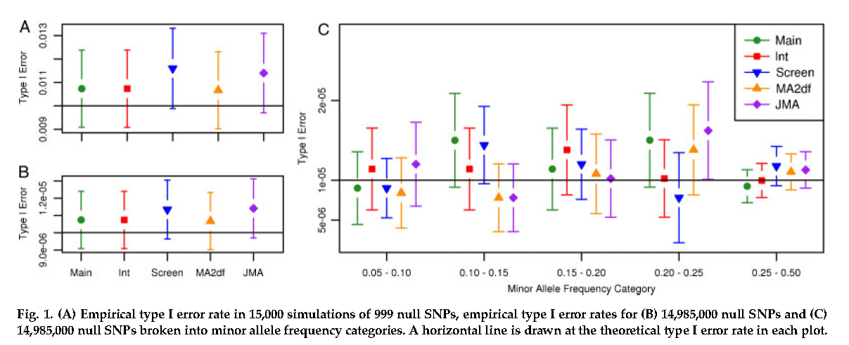
Source: Manning AK, LaValley M, Liu CT, et al. Meta-Analysis of Gene-Environment Interaction:
Joint Estimation of SNP and SNP x Environment Regression Coefficients. Genet Epidemiol 2011, 35(1):11-8.
Avoid putting too many lines on the same chart. In the example below, the only thing that is readily apparent is that 1980 was a very hot summer.
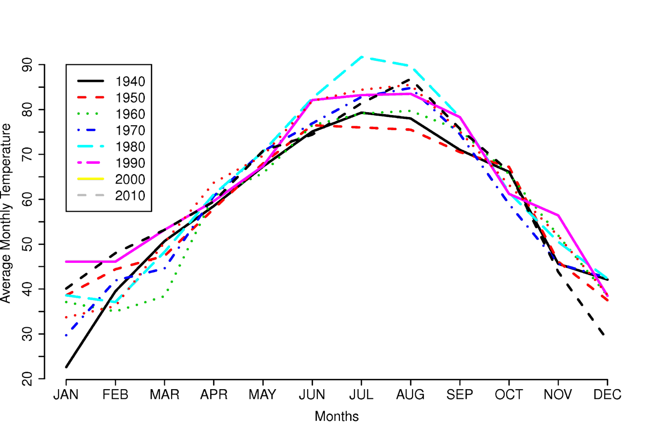
Data from National Weather Service Weather Forecast Office at
http://www.srh.noaa.gov/tsa/?n=climo_tulyeartemp