


Make Efficient Use of Space
|
More Tips:
|
Reduce the Ratio of Ink to Information
This isn't efficient, because this graphic is totally uninformative.
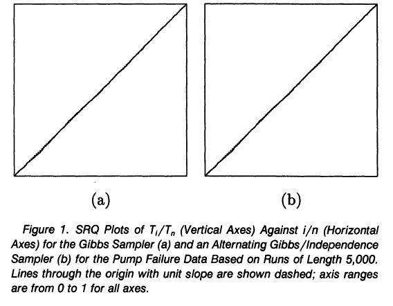
Source: Mykland P, Tierney L, Yu B (1995) Regeneration in Markov chain samplers. Journal of the American Statistical Association 90:233-241, Figure 1
|
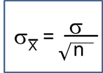
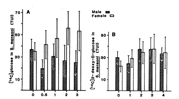
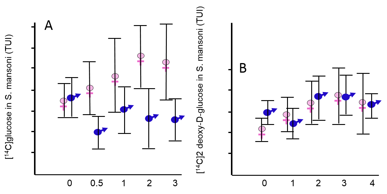
Bar charts are not appropriate for indicating means ± SEs. The only important information is the mean and the variation about the mean. Consider the figure to the right. By representing a mean with a number and a bar that has width, the information is representing one number over and over with:
|
|

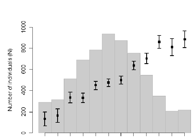
Bar graphs add ink without conveying any additional information, and they are distracting. The graph below on the left inappropriately uses bars which clutter the graph without adding anything. The graph on the right displays the same data, by does so more clearly and with less clutter.
|
Source: Conford EM, Huot ME. Glucose transfer from male to female schistosomes. Science. 1981 213:1269-71 |
|
|
"Just as a good editor of prose ruthlessly prunes unnecessary words, so a designer of statistical graphics should prune out ink that fails to present fresh data-information. Although nothing can replace a good graphical idea applied to an interesting set of numbers, editing and revision are as essential to sound graphical design work as they are to writing." Edward R. Tufte, "The Visual Display of Quantitative Information" |
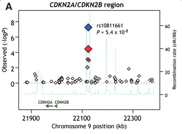
Multiple Types of Information on the Same Figure
|
|
|