


Choosing the Best Graph Type
>
|
Adapted from Frank E Harrell, Jr: on Graphics: http://biostat.mc.vanderbilt.edu/twiki/pub/Main/StatGraphCourse/graphscourse.pdf
|
Bar Charts, Error Bars and Dot Plots
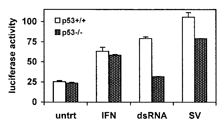
As noted previously, bar charts can be problematic. Here is another one presenting means and error bars, but the error bars are misleading because they only extend in one direction. A better alternative would have been to to use full error bars with a scatter plot, as illustrated previously (right).
|
Source: Hummer BT, Li XL, Hassel BA (2001) Role for p53 in gene induction by double-stranded RNA. J Virol 75:7774-7777, Figure 4 |
|
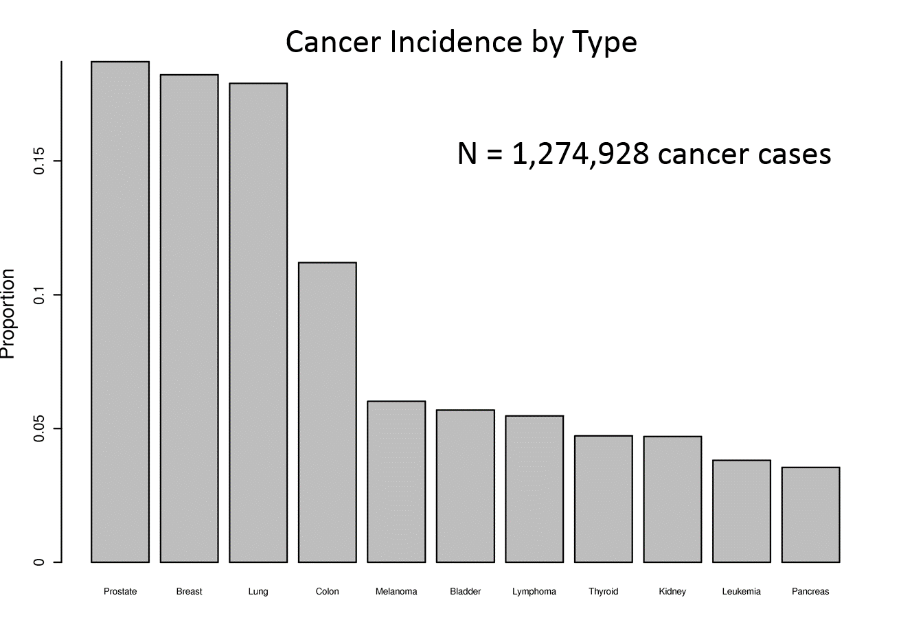
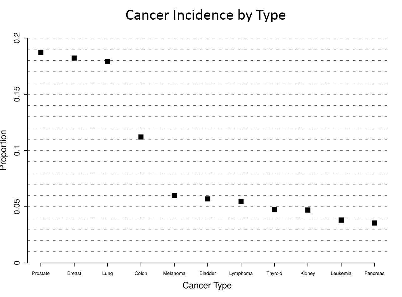
Consider the four graphs below presenting the incidence of cancer by type. The upper left graph unnecessary uses bars, which take up a lot of ink. This layout also ends up making the fonts for the types of cancer too small. Small font is also a problem for the dot plot at the upper right, and this one also has unnecessary grid lines across the entire width.
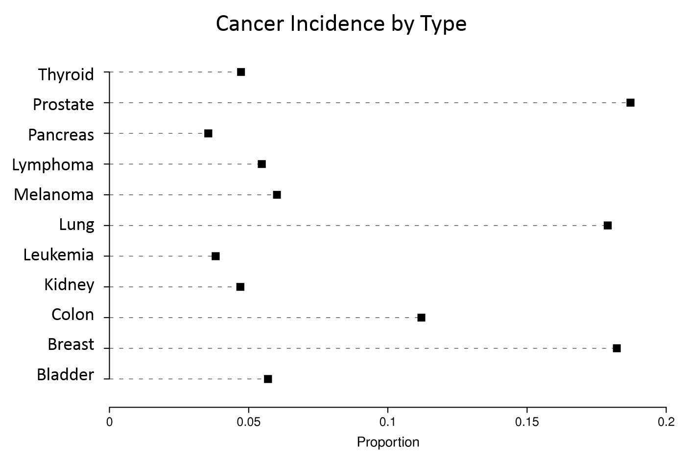
The graph at the lower left has more readable labels and uses a simple dot plot, but the rank order is difficult to figure out.
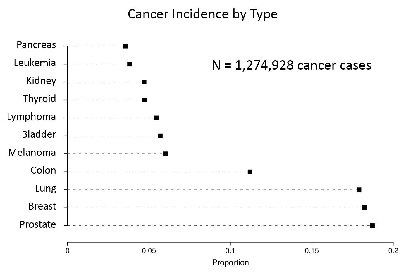
The graph at the lower right is clearly the best, since the labels are readable, the magnitude of incidence is shown clearly by the dot plots, and the cancers are sorted by frequency.
|
************************* + |
|
|
|
|
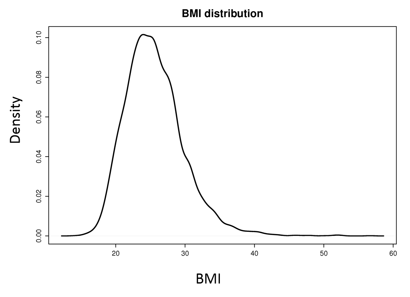
Single Continuous Numeric Variable
In this situation a cumulative distribution function conveys the most information and requires no grouping of the variable. A box plot will show selected quantiles effectively, and box plots are especially useful when stratifying by multiple categories of another variable.
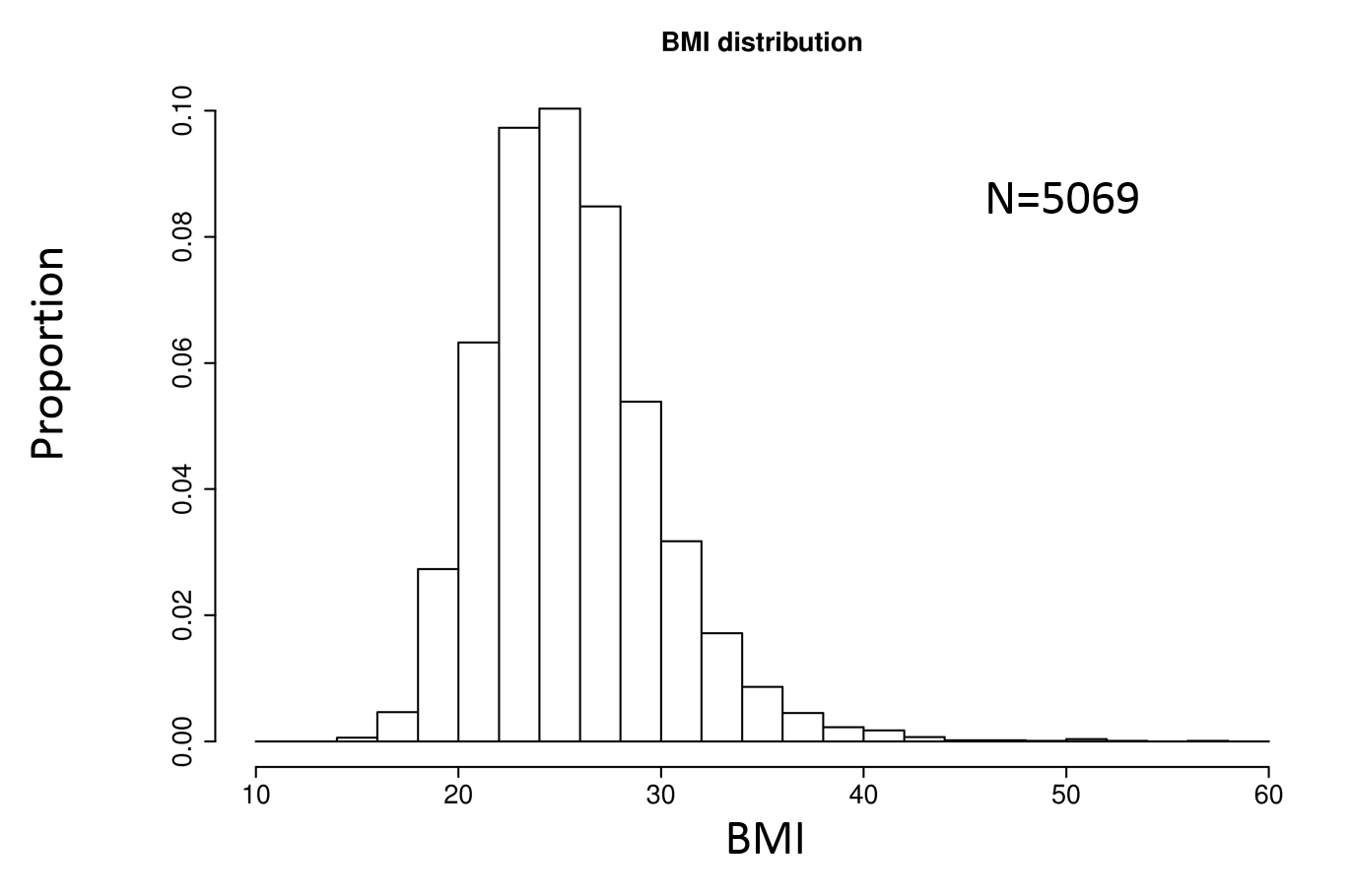
Histograms are also possible. Consider the examples below.
|
Density Plot |
Histogram |
Box Plot |
|
|
|
|
Two Variables
|
Adapted from Frank E. Harrell Jr. on graphics: http://biostat.mc.vanderbiltedu/twiki/pub/Main/StatGraphCourse/graphscourse.pdf Two categorical variables
Two continuous variables
|
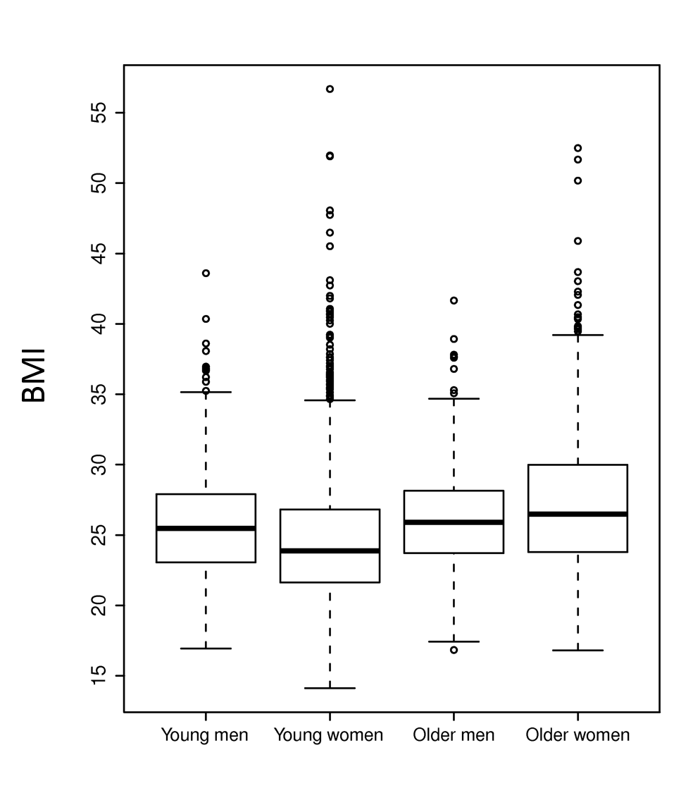
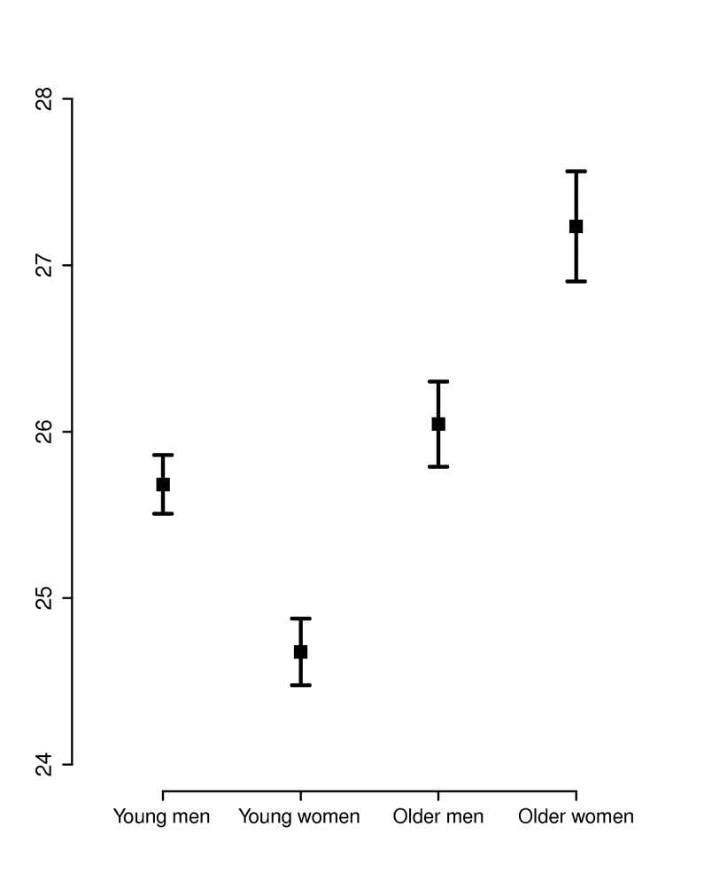
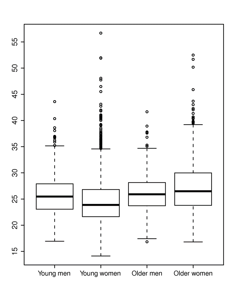
The two graphs below summarize BMI (Body Mass Index) measurements in four categories, i.e., younger and older men and women. The graph on the left shows the means and 95% confidence interval for the mean in each of the four groups. This is easy to interpret, but the viewer cannot see that the data is actually quite skewed. The graph on the right shows the same information presented as a box plot. With this presentation method one gets a better understanding of the skewed distribution and how the groups compare.
|
|
|
The next example is a scatter plot with a superimposed smoothed line of prediction. The shaded region embracing the blue line is a representation of the 95% confidence limits for the estimated prediction. This was created using "ggplot" in the R programming language.
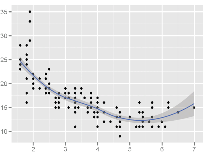
Source: Frank E. Harrell Jr. on graphics: http://biostat.mc.vanderbilt.edu/twiki/pub/Main/StatGraphCourse/graphscourse.pdf (page 121)
Multivariate Data
|
The example below shows the use of multiple panels.
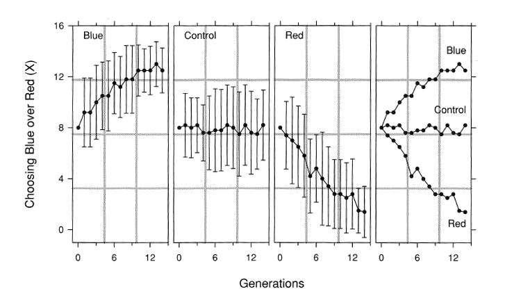
Source: Cleveland S. The Elements of Graphing Data. Hobart Press, Summit, NJ, 1994.