


More Principles of Graphical Excellence
|
Adapted from Frank E. Harrell Jr. on graphics: http://biostat.mc.vanderbilt.edu/twiki/pub/Main/StatGraphCourse/graphscourse.pdf ] |
Exclude Unneeded Dimensions
|
|
Source: Cotter DJ, et al. (2004) Hematocrit was not validated as a surrogate endpoint for survival among epoetin-treated hemodialysis patients. Journal of Clinical Epidemiology 57:1086-1095, Figure 2. |
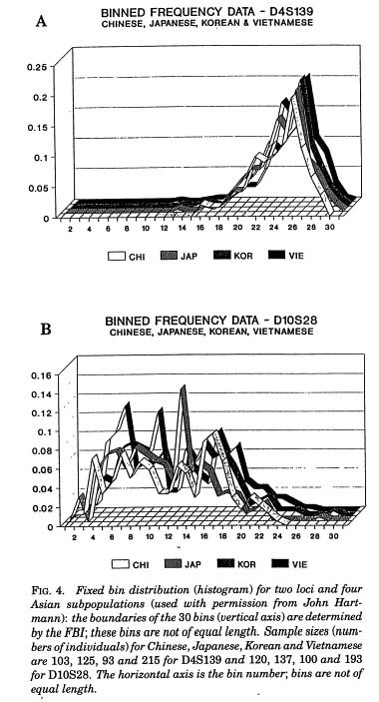
Source: Roeder K (1994) DNA fingerprinting: A review of the controversy (with discussion). Statistical Science 9:222-278, Figure 4. |
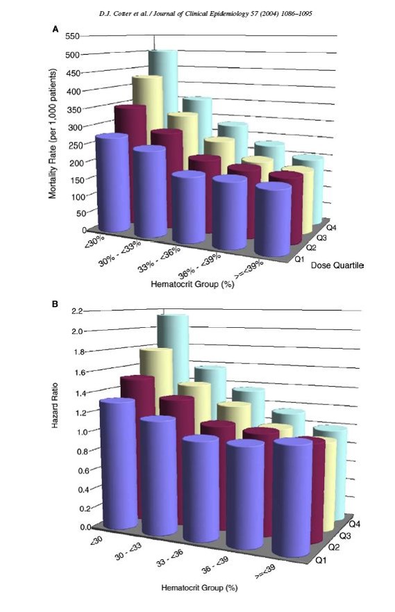
These 3-dimensional techniques distort the data and actually interfere with our ability to make accurate comparisons. The distortion caused by 3-dimensional elements can be particularly severe when the graphic is slanted at an angle or when the viewer tends to compare ends up unwittingly comparing the areas of the ink rather than the heights of the bars.
It is much easier to make comparisons with a chart like the one below.
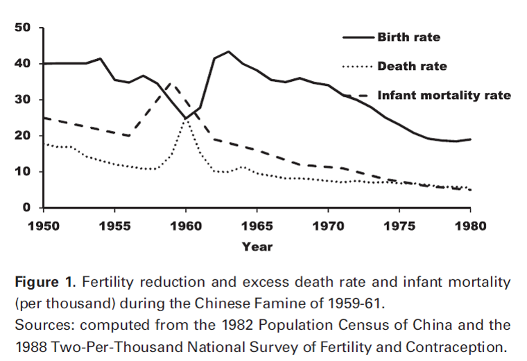
Source: Huang, C, Guo C, Nichols C, Chen S, Martorell R. Elevated levels of protein in urine in adulthood after exposure to
the Chinese famine of 1959–61 during gestation and the early postnatal period. Int. J. Epidemiol. (2014) 43 (6): 1806-1814 .
Omit "Chart Junk"
|
Consider these two examples.
|
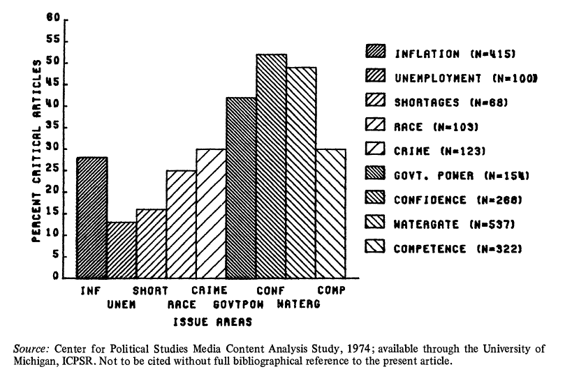
Hash lines are what E.R. Tufte refers to as "chart junk."
This graphic uses unnecessary bar graphs, pointless and annoying cross-hatching, and labels with incomplete abbreviations. The cluttered legend expands the inadequate bar labels, but it is difficult to go back and forth from the legend to the bar graph, and the use of all uppercase letters is visually unappealing. This presentation would have been greatly enhanced by simply using a horizontal dot plot that rank ordered the categories in a logical way. This approach could have been cleared and would have completely avoided the need for a legend. |
This grey background is a waste of ink, and it actually detracts from the readability of the graph by reducing contrast between the data points and other elements of the graph. Also, the axis labels are too small to be read easily. |
|
Source: Miller AH, Goldenberg EN, Erbring L. (1979) Type-Set Politics: Impact of Newspapers on Public Confidence. American Political Science Review, 73:67-84. |
Source: Jorgenson E, et al. (2005) Ethnicity and human genetic linkage maps. American Journal of Human Genetics 76:276-290, Figure 2 |
Here is a simple enumeration of the number of pets in a neighborhood. There is absolutely no reason to connect these counts with lines. This is, in fact, confusing and inappropriate and nothing more than "chart junk."
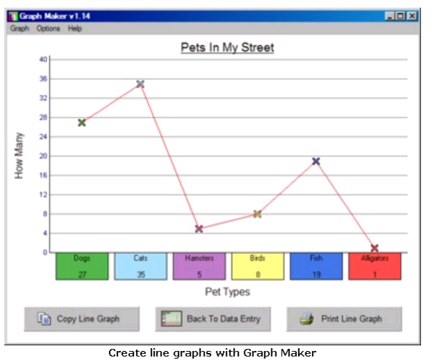
Source: http://www.go-education.com/free-graph-maker.html
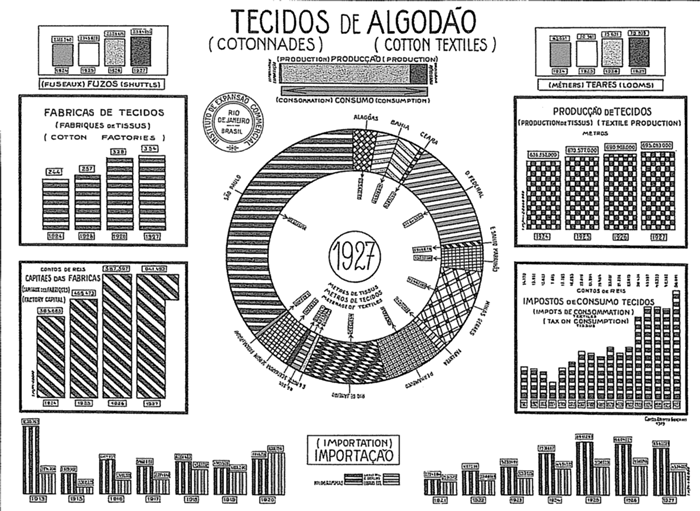
Moiré Vibration
Moiré effects are sometimes used in modern art to produce the appearance of vibration and movement. However, when these effects are applied to statistical presentations, they are distracting and add clutter because the visual noise interferes with the interpretation of the data.
Tufte presents the example shown below from Instituto de Expansao Commercial, Brasil, Graphicos Estatisticas (Rio de Janeiro, 1929, p. 15).
While the intention is to present quantitative information about the textile industry, the moiré effects do not add anything, and they are distracting, if not visually annoying.