

Box Plots
A "boxplot", or "box-and-whiskers plot" is a graphical summary of a distribution; the box in the middle indicates "hinges" (close to the first and third quartiles) and median. The lines ("whiskers") show the largest or smallest observation that falls within a distance of 1.5 times the box size from the nearest hinge. If any observations fall farther away, the additional points are considered "extreme" values and are shown separately. A boxplot can often give a good idea of the data distribution, and is often more useful to compare distributions side-by-side, as it is more compact than a histogram. We will see an example soon.
> boxplot(airquality$Ozone) #Figure 2.2.3a
We can use the boxplot function to calculate quick summaries for all the variables in our data set—by default, R computes boxplots column by column. Notice that missing data causes no problems to the boxplot function (similar to summary).
> boxplot(airquality[,1:4])
# Figure 2.2.3b: only for numerical variables
|
|
|
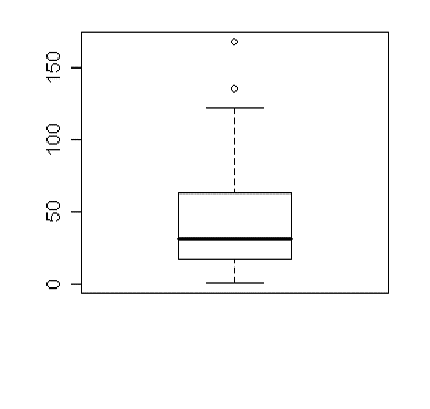
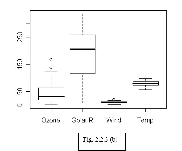
Figure (b) is not really meaningful as the variables may not be on comparable scales. The real power of box plots is really to do comparisons of variables by sub-grouping. For example, we may be interested in comparing the fluctuations in temperature across months. To create boxplots of temperature data grouped by the factor "month", we use the command:
> boxplot(airquality$Temp ~ airquality$Month)
We can also write the same command using a slightly more readable language:
> boxplot(Temp ~ Month, data = airquality)
The tilde symbol "~" indicates which factor to group by. We will come back to more discussion on plotting grouped data later on.
Boxplots and Boxplots With Groups in R (R Tutorial 2.2) MarinStatsLectures [Contents ]
]
![]()
![]()
