Summary Statistics and Graphs with R
Exploratory Data Analysis
Table of Contents»
Ching-Ti Liu, PhD, Associate Professor, Biostatistics
Jacqueline Milton, PhD, Clinical Assistant Professor, Biostatistics
Avery McIntosh, doctoral candidate
By the end of this session students will be able to:
Can you explain each of the following data types and give examples of each?
Can you outline the summary statistics one would use for each of these data types?
The first module in this series provided an introduction to working with datasets and computing some descriptive statistics. We will continue this with the airquality data.
To recall the components of the data set, print out the first 5 rows.
> airquality[1:5,]
Ozone Solar.R Wind Temp Month Day
1 41 190 7.4 67 5 1
2 36 118 8.0 72 5 2
3 12 149 12.6 74 5 3
4 18 313 11.5 62 5 4
5 NA NA 14.3 56 5 5
Recall that we can compute the mean Temp by "extracting" the variable Temp from the dataset using the $ function as follows:
> mean(airquality$Temp)
[1] 77.88235
Similarly, we can compute the median Temp:
> median(airquality$Temp)
[1] 79
> var(airquality$Wind)
[1] 12.41154
If we don't want to keep using the "$" sign to point to the data set, we a can use the attach command to keep the data set as the current or working one in R, and then just call the variables by name. For example, the above can then be accomplished by:
> attach(airquality)
> var(Wind)
Once we are finished working with this data set, we can use the detach() command to remove this data set from the working memory.
|
Never attach two data sets that share the same variable names- this could lead to confusion and errors! A good idea is to detach a data set as soon as you have finished working with it. |
For now, let's keep this data set attached, while we test out some other functions.
By default you get the minimum, the maximum, and the three quartiles — the 0.25, 0.50, and 0.75 quantiles. The difference between the first and third quartiles is called the interquartile range (IQR) and is sometimes used as an alternative to the standard deviation.
> quantile(airquality$Temp)
0% 25% 50% 75% 100%
56 72 79 85 97
It is also possible to obtain other quantiles; this is done by adding an argument containing the desired percentage cut points. To get the deciles, use the sequence function:
> pvec <- seq(0,1,0.1) #sequence of digits from 0 to 1, by 0.1
> pvec
[1] 0.0 0.1 0.2 0.3 0.4 0.5 0.6 0.7 0.8 0.9 1.0
> quantile(airquality$Temp, pvec)
0% 10% 20% 30% 40% 50% 60% 70% 80% 90% 100%
56.0 64.2 69.0 74.0 76.8 79.0 81.0 83.0 86.0 90.0 97.0
 How would you use this method to get quintiles? Answer
We can also get summary statistics for multiple columns at once, using the apply() command. apply() is extremely useful, as are its cousins tapply() and lapply() (more on these functions later).
Let's first find the column means using the apply command:
> apply(airquality, 2, mean) #do for multiple columns at once
Error in FUN(newX[, i], ...) : missing observations in cov/cor
We get an error because the data contains missing observations! R will not skip missing values unless explicitly requested to do so. You can give the na.rm argument (not available, remove) to request that missing values be removed:
> apply(airquality, 2, mean, na.rm=T)
Ozone Solar.R Wind Temp Month Day
42.129310 185.931507 9.957516 77.882353 6.993464 15.803922
This can be done even when calculating a summary for a single column as well:
> mean(airquality$Ozone, na.rm=T)
[1] 42.12931
There is also a summary function that gives a number of summaries on a numeric variable (or even the whole data frame!) in a nice vector format:
> summary(airquality$Ozone) #note we don't need "na.rm" here
Min. 1st Qu. Median Mean 3rd Qu. Max. NA's
1.00 18.00 31.50 42.13 63.25 168.00 37.00
> summary(airquality)
Ozone Solar.R Wind Temp Month Day
Min. : 1.00 Min. : 7.0 Min. : 1.700 Min. :56.00 Min. :5.000 Min. : 1.00
1st Qu.: 18.00 1st Qu.:115.8 1st Qu.: 7.400 1st Qu.:72.00 1st Qu.:6.000 1st Qu.: 8.00
Median : 31.50 Median :205.0 Median : 9.700 Median :79.00 Median :7.000 Median :16.00
Mean : 42.13 Mean :185.9 Mean : 9.958 Mean :77.88 Mean :6.993 Mean :15.80
3rd Qu.: 63.25 3rd Qu.:258.8 3rd Qu.:11.500 3rd Qu.:85.00 3rd Qu.:8.000 3rd Qu.:23.00
Max. :168.00 Max. :334.0 Max. :20.700 Max. :97.00 Max. :9.000 Max. :31.00
NA's : 37.00 NA's : 7.0
Notice that "Month" and "Day" are coded as numeric variables even though they are clearly categorical. This can be mended as follows, e.g.:
> airquality$Month = factor(airquality$Month)
> summary(airquality)
Ozone Solar.R Wind Temp Month Day
Min. : 1.00 Min. : 7.0 Min. : 1.700 Min. :56.00 5:31 Min. : 1.00
1st Qu.: 18.00 1st Qu.:115.8 1st Qu.: 7.400 1st Qu.:72.00 6:30 1st Qu.: 8.00
Median : 31.50 Median :205.0 Median : 9.700 Median :79.00 7:31 Median :16.00
Mean : 42.13 Mean :185.9 Mean : 9.958 Mean :77.88 8:31 Mean :15.80
3rd Qu.: 63.25 3rd Qu.:258.8 3rd Qu.:11.500 3rd Qu.:85.00 9:30 3rd Qu.:23.00
Max. :168.00 Max. :334.0 Max. :20.700 Max. :97.00 Max. :31.00
NA's : 37.00 NA's : 7.0
Notice how the display changes for the factor variables.
|
Find the standard deviations (SDs) of all the numeric variables in the air quality data set, using the apply function. |
Summary Statistics in R: Mean, Standard Deviation, Frequencies, etc (R Tutorial 2.7) MarinStatsLectures [Contents]
 The simplest display for the shape of a distribution of data can be done using a histogram- a count of how many observations fall within specified divisions ("bins") of the x-axis.
> hist(airquality$Temp)
A sensible number of classes (bins) is usually chosen by R, but a recommendation can be given with the nclass (number of classes) or breaks argument.
> hist(airquality$Temp, breaks = 20)
By choosing breaks as a vector rather than a number, you can have full control over the interval divisions. By default, R plots the frequencies in the histogram, if you would rather plot the relative frequencies, you need to use the argument prob=T.
> hist(airquality$Temp, prob=T)
There are a LOT of options to spruce this up. Here is code for a much nicer histogram
> hist(airquality$Temp,prob=T,main="Temperature")
>
> points(density(airquality$Temp),type="l",col="blue")
>
> rug(airquality$Temp,col="red")
If we want to fit a normal curve over the data, instead of the command density() we can use dnorm() and curve() like so:
> m<-mean(airquality$Temp);std<-sqrt(var(airquality$Temp))
> hist(airquality$Temp,prob=T,main="Temperature")
> curve(dnorm(x, mean=m, sd=std), col="darkblue", lwd=2, add=TRUE)
**Note : You need to make sure that you have prob=T as an argument in your historgram !
|
|
|
If you type help(hist) into the command line, it shows all the possible parameters you can add to a standard histogram. There are a lot of options.
If you want two or more plots in the same window, you can use the command
> par(mfrow=c(#rows,#columns))
With the airquality dataset, we can do
> par(mfrow=c(2,2))
> hist(airquality$Temp, prob=T)
> hist(airquality$Ozone, prob=T)
> hist(airquality$Wind, prob=T)
> hist(airquality$Solar.R, prob=T)

Histograms in R (R Tutorial 2.3) MarinStatsLectures [Contents]
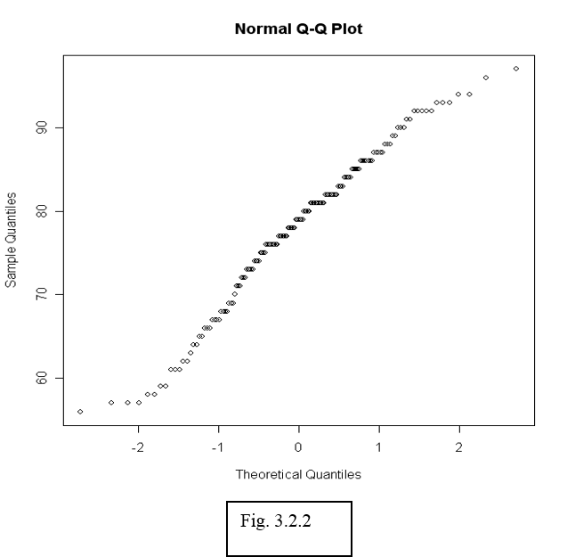
To see whether data can be assumed normally distributed, it is often useful to create a qq-plot. In a qq-plot, we plot the kth smallest observation against the expected value of the kth smallest observation out of n in a standard normal distribution.
We expect to obtain a straight line if data come from a normal distribution with any mean and standard deviation.
> qqnorm(airquality$Temp)
The observed (empirical) quantiles are drawn along the vertical axis, while the theoretical quantiles are along the horizontal axis. With this convention the distribution is normal if the slope follows a diagonal line, curves towards the end indicate a heavy tail. This will come in handy when we move on to linear regression.
After the plot has been generated, use the function qqline() to fit a line going through the first and third quartile. This can be used to judge the goodness-of-fit of the QQ-plot to a straight line.
|
Use a histogram and qq-plot to determine whether the Ozone measurements in the air quality data can be considered normally distributed. |
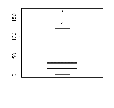
A "boxplot", or "box-and-whiskers plot" is a graphical summary of a distribution; the box in the middle indicates "hinges" (close to the first and third quartiles) and median. The lines ("whiskers") show the largest or smallest observation that falls within a distance of 1.5 times the box size from the nearest hinge. If any observations fall farther away, the additional points are considered "extreme" values and are shown separately. A boxplot can often give a good idea of the data distribution, and is often more useful to compare distributions side-by-side, as it is more compact than a histogram. We will see an example soon.
> boxplot(airquality$Ozone) #Figure 2.2.3a
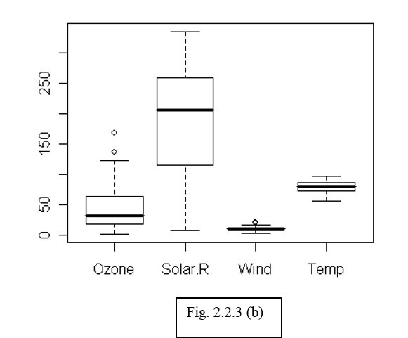
We can use the boxplot function to calculate quick summaries for all the variables in our data set—by default, R computes boxplots column by column. Notice that missing data causes no problems to the boxplot function (similar to summary).
> boxplot(airquality[,1:4])
# Figure 2.2.3b: only for numerical variables
|
|
|
Figure (b) is not really meaningful as the variables may not be on comparable scales. The real power of box plots is really to do comparisons of variables by sub-grouping. For example, we may be interested in comparing the fluctuations in temperature across months. To create boxplots of temperature data grouped by the factor "month", we use the command:
> boxplot(airquality$Temp ~ airquality$Month)
We can also write the same command using a slightly more readable language:
> boxplot(Temp ~ Month, data = airquality)
The tilde symbol "~" indicates which factor to group by. We will come back to more discussion on plotting grouped data later on.
Boxplots and Boxplots With Groups in R (R Tutorial 2.2) MarinStatsLectures [Contents]
One very commonly used tool in exploratory analysis of multivariate data is the scatterplot. We will look at this in more detail later when we discuss regression and correlation. The R command for drawing a scatterplot of two variables is a simple command of the form "plot(x,y)."
> plot(airquality$Temp, airquality$Ozone) # How do Ozone and temperature measurements relate?
With more than two variables, the pairs() command draws a scatterplot matrix.
|
Write the following command in R and describe what you see in terms of relationships between the variables. > pairs(airquality[,1:4]) |
The default plotting symbols in R are not always pretty! You can actually change the plotting symbols, or colors to something nicer. For example, the following command
> plot(airquality$Temp, airquality$Ozone, col="red", pch =19)
repeats the scatterplot, this time with red filled circles that are nicer to look at. "col" refers to the color of symbols plotted. The full range of point plotting symbols used in R are given by "pch" in the range 1 to 25; see the help on "points" to see what each of these represent.
Scatterplots in R (R Tutorial 2.6) MarinStatsLectures [Contents]
Modifying Plots in R (R Tutorial 2.8) MarinStatsLectures [Contents]
Adding Text to Plots in R (R Tutorial 2.9) MarinStatsLectures [Contents]
A neat way to summarize data that could just as easily be put in a histogram is to use a stem-and-leaf plot (compare to a histogram):
> stem(rnorm(40,100))
The decimal point is 1 digit(s) to the right of the |
97 | 7
98 |
98 | 5669
99 | 00224
99 | 58
100 | 00111111122233
100 | 55567889
101 | 014
101 | 6
102 | 01
Note that the command rnorm(40,100) that generated these data is a standard R command that generates 40 random normal variables with mean 100 and variance 1 (by default). For more information, use the help function. Type ?rnorm to see the options for this command.
Stem and Leaf Plots in R (R Tutorial 2.4) MarinStatsLectures [Contents]
When dealing with grouped data, you will often want to have various summary statistics computed within groups; for example, a table of means and standard deviations. This can be done using the tapply() command. For example, we might want to compute the mean temperatures in each month:
> tapply(airquality$Temp, airquality$Month, mean)
5 6 7 8 9
65.54839 79.10000 83.90323 83.96774 76.90000
If there are any missing values, these can be excluded if we simply adding an extra argument na.rm=T to tapply.
|
Compute the range and mean of Ozone levels for each month, using the tapply command. |
With grouped data, it is important to be able not only to create plots for each group but also to compare the plots between groups. We have already looked at examples with histograms and boxplots. As a further example, let us consider another data set esoph in R, relating to a case-control study of esophageal cancer in France, containing records for 88 age/alcohol/tobacco combinations. (Look up the R help on this data set to find out more about the variables.) The first 5 rows of the data are shown below:
> esoph[1:5,]
agegp alcgp tobgp ncases ncontrols
1 25-34 0-39g/day 0-9g/day 0 40
2 25-34 0-39g/day 10-19 0 10
3 25-34 0-39g/day 20-29 0 6
4 25-34 0-39g/day 30+ 0 5
5 25-34 40-79 0-9g/day 0 27
We can draw a boxplot of the number of cancer cases according to each level of alcohol consumption (alcgp):
> boxplot(esoph$ncases ~ esoph$alcgp)
We could also equivalently write:
> boxplot(ncases ~ alcgp, data = esoph)
Notation of the type y ~ x can be read as "y described using x". This is an example of a "model formula". We will encounter many more examples of model formulas later on- such as when we use R for regression analysis.
If the data set is small, sometimes a boxplot may not be very accurate, as the quartiles are not well estimated from the data and may give a falsely inflated or deflated figure. In those cases, plotting the raw data may be more desirable. This can be done using a strip chart. By hand, this is equivalent to a dot diagram where every number is marked with a dot on a number line.
|
What does the following command do?
> stripchart(ncases ~ agegp)
|
|
Detach the esoph data set and attach the air quality data set. Next, create the following plots in R, using the commands you have learnt above:
|
Categorical data are often described in the form of tables. We now discuss how you can create tables from your data and calculate relative frequencies. The simple "table" command in R can be used to create one-, two- and multi-way tables from categorical data. For the next few examples we will be using the dataset airquality.new.csv. Here is a preview of the dataset:
Ozone Solar.R Wind Temp Month Day goodtemp badozone
1 41 190 7.4 67 5 1 low low
2 36 118 8.0 72 5 2 low low
3 12 149 12.6 74 5 3 low low
4 18 313 11.5 62 5 4 low low
7 23 299 8.6 65 5 7 low low
The columns good temp and badozone represent days when temperatures were greater than or equal to 80 (good) or not (low) and if the ozone was greater than or equal to 60 (high) or not (low), respectively.
|
Read in the airquality.new.csv file and print out rows 50 to 60 of the new data set airquality.new. |
Now, let us construct some simple tables. Make sure you first detach the air quality data set and attach airquality.new.
> table(goodtemp)
goodtemp
high low
54 57
> table(badozone)
> table(goodtemp, badozone)
> table(goodtemp, Month)
Month
goodtemp 5 6 7 8 9
high 1 4 24 15 10
low 23 5 2 8 19
We can also construct tables with more than two sides in R. For example, what do you see when you do the following?
> table(goodtemp, Month, badozone)
As you add dimensions, you get more of these two-sided subtables and it becomes rather easy to lose track. This is where the ftable command is useful. This function creates "flat" tables; e.g., like this:
> ftable (goodtemp + badozone ~ Month)
goodtemp high low
badozone high low high low
Month
5 0 1 1 22
6 1 3 0 5
7 13 11 0 2
8 10 5 0 8
9 4 6 0 19
It may sometimes be of interest to compute marginal tables; that is, the sums of the counts along one or the other dimension of a table, or relative frequencies, generally expressed as proportions of the row or column totals.
These can be done by means of the margin.table() and prop.table() functions respectively. For either of these, we first have to construct the original cross-table.
> Temp.month = table(goodtemp, Month)
> margin.table(Temp.month,1)
## what does the second index (1 or 2) mean?
> margin.table(Temp.month,2)
> prop.table(Temp.month,2)
For presentation purposes, it may be desirable to display a graph rather than a table of counts or percentages, with categorical data. One common way to do this is through a bar plot or bar chart, using the R command barplot. With a vector (or 1-way table), a bar plot can be simply constructed as:
> total.temp = margin.table(Temp.month,2)
> barplot(total.temp) ## what does this show?
If the argument is a matrix, then barplot creates by default a "stacked barplot", where the columns are partitioned according to the contributions from different rows of the table. If you want to place the row contributions beside each other instead, you can use the argument beside=T.
|
Construct a table of the "badozone" variable by month from the air quality data. Then create and interpret the bar plot you get using the following commands: > ozone.month = table(badozone, Month) > barplot(ozone.month) > barplot(ozone.month, beside=T)
The bar plot by default appears in color; if you want a black-and-white illustration, you just need to add the argument col="white". |
Bar Charts and Pie Charts in R (R Tutorial 2.1) MarinStatsLectures [Contents]
Dot charts can be employed to study a table from both sides at the same time. They contain the same information as barplots with beside=T but give quite a different visual impression.
> dotchart(ozone.month)
Pie charts are generally not a good way to represent data because they are often used to make trivial data look impressive and are difficult to interpret They rarely contain information that would not have been at least as effectively conveyed in a bar plot. In R, they can be created using the pie() command, the argument being the same as that taken by barplot().
Click on the figure created in R so that the window is selected. Now click on "File" and "Save as"- you will see a number of options for file formats to save the file in. Common ones are PDF, png, jpeg, etc.. The "png" (portable network graphic) format is often the most compact, and is readable on different platforms and can be easily inserted into Word or PowerPoint documents.
There is also a direct "command-line" option to save figures as a file from R. The command varies according to file format, but the basic syntax is to open the file to save in, then create the plot, and finally close the file. For example,
> png("barplotozone.png") ## name the file to save the figure in
> barplot(ozone.month, beside=T)
> dev.off() ## close the plotting device
This option is often useful when you need to plot a large number of figures at once, and doing them one-by-one becomes cumbersome. There are also a number of ways to control the shape and size of the figure, look up the help on the figure plotting functions (e.g. "help(png)") for more details.
Summary:
(For some examples of 3D plots, see the posted R code 3d plots.R.)
Reading:
In particular note the abline() and legend() functions on page 72 (very useful!!), and section 12.4.2 and 12.5.1. You will need this for the homework.
Assignment: