

QQ Plots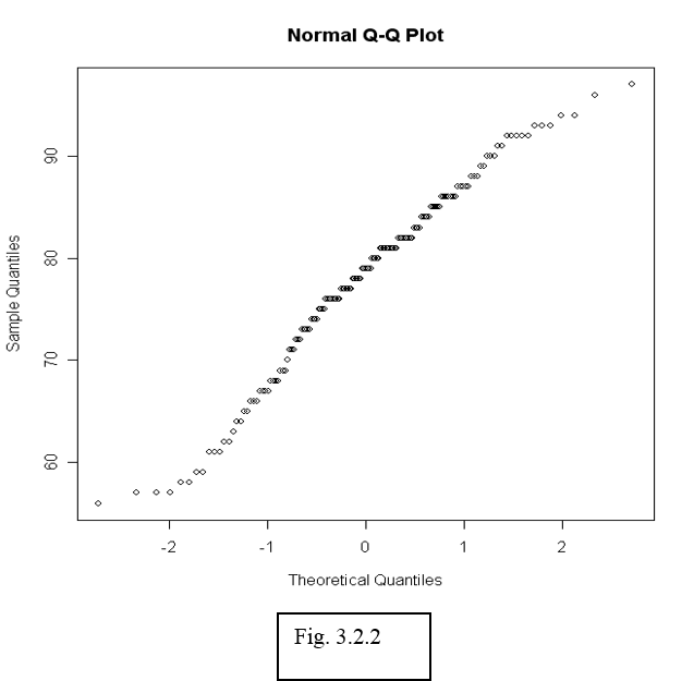
To see whether data can be assumed normally distributed, it is often useful to create a qq-plot. In a qq-plot, we plot the kth smallest observation against the expected value of the kth smallest observation out of n in a standard normal distribution.
We expect to obtain a straight line if data come from a normal distribution with any mean and standard deviation.
> qqnorm(airquality$Temp)
The observed (empirical) quantiles are drawn along the vertical axis, while the theoretical quantiles are along the horizontal axis. With this convention the distribution is normal if the slope follows a diagonal line, curves towards the end indicate a heavy tail. This will come in handy when we move on to linear regression.
After the plot has been generated, use the function qqline() to fit a line going through the first and third quartile. This can be used to judge the goodness-of-fit of the QQ-plot to a straight line.
|
Use a histogram and qq-plot to determine whether the Ozone measurements in the air quality data can be considered normally distributed. |