


Table or Graph?
- Tables are generally best if you want to be able to look up specific information or if the values must be reported precisely.
- Graphics are best for illustrating trends and making comparisons
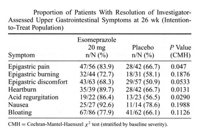
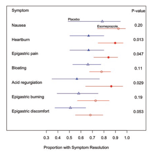
The side by side illustrations below show the same information, first in table form and then in graphical form. While the information in the table is precise, the real goal is to compare a series of clinical outcomes in subjects taking either a drug or a placebo. The graphical presentation on the right makes it possible to quickly see that for each of the outcomes evaluated, the drug produced relief in a great proportion of subjects. Moreover, the viewer gets a clear sense of the magnitude of improvement, and the error bars provided a sense of the uncertainty in the data.
|
Source: Connor JT. Statistical Graphics in AJG: Save the Ink for the Information. Am J of Gastroenterology. 2009; 104:1624-1630. |
|
Principles for Table Display
- Sort table rows in a meaningful way
- Avoid alphabetical listing!
- Use rates, proportions or ratios in addition (or instead of) totals
- Show more than two time points if available
- Multiple time points may be better presented in a Figure
- Similar data should go down columns
- Highlight important comparisons
- Show the source of the data
Consider the data in the table below from http://www.cancer.gov/cancertopics/types/commoncancers
|
Type |
Incidence |
Proportion |
|---|---|---|
|
Bladder |
72,570 |
5.7% |
|
Breast |
232,340 |
18.2% |
|
Colon |
142,820 |
11.2% |
|
Kidney |
59,938 |
4.7% |
|
Leukemia |
48,610 |
3.8% |
|
Lung |
228,190 |
17.9% |
|
Melanoma |
76,690 |
6.0% |
|
Lymphoma |
69,740 |
5.5% |
|
Pancreas |
45,220 |
3.5% |
|
Prostate |
238,590 |
18.7% |
|
Thyroid |
60,220 |
4.7% |
Our ability to quickly understand the relative frequency of these cancers is hampered by presenting them in alphabetical order. It is much easier for the reader to grasp the relative frequency by listing them from most frequent to least frequent as in the next table.
|
Type |
Incidence |
Proportion |
|---|---|---|
|
Prostate |
238,590 |
18.7% |
|
Breast |
232,340 |
18.2% |
|
Lung |
228,340 |
17.9% |
|
Colon |
142,820 |
11.2% |
|
Melanoma |
76,690 |
6.0% |
|
Bladder |
72,570 |
5.7% |
|
Lymphoma |
69,740 |
5.5% |
|
Thyroid |
60,220 |
4.7% |
|
Kidney |
59,938 |
4.7% |
|
Leukemia |
48,610 |
3.8% |
|
Pancreas |
45,220 |
3.5% |
However, the same information might be presented more effectively with a dot plot, as shown below.
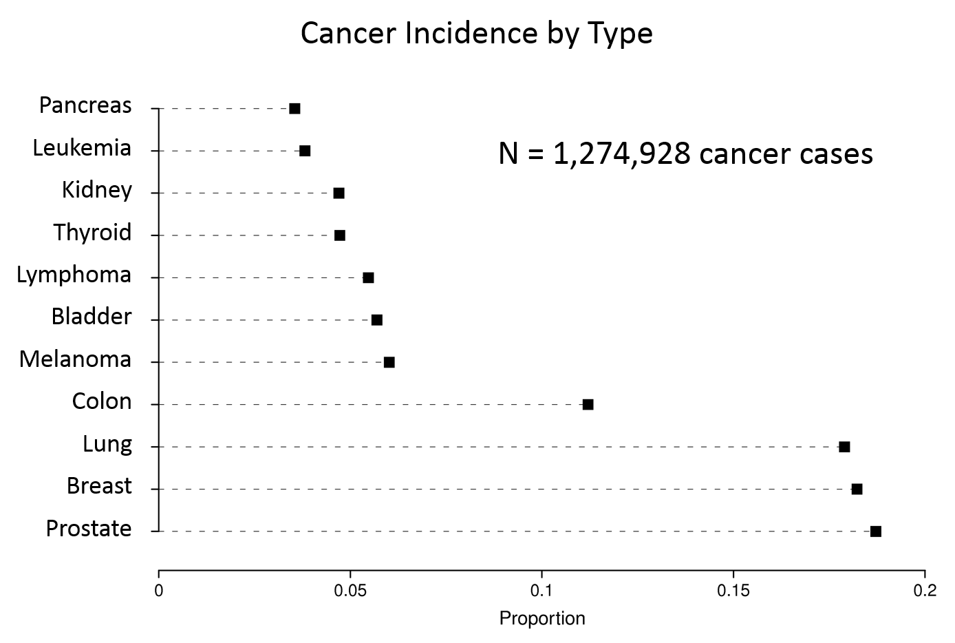
Data from http://www.cancer.gov/cancertopics/types/commoncancers