


Principles of Graphical Excellence from E.R. Tufte
|
From E. R. Tufte. The Visual Display of Quantitative Information, 2nd Edition. Graphics Press, Cheshire, Connecticut, 2001.
|
Pattern Perception
Pattern perception is done by
- Detection: recognition of geometry encoding physical values
- Assembly: grouping of detected symbol elements; discerning overall patterns in data
- Estimation: assessment of relative magnitudes of two physical values
Geographic Variation in Cancer
As an example, Tufte offers a series of maps that summarize the age-adjusted mortality rates for various types of cancer in the 3,056 counties in the United States. The maps showing the geographic variation in stomach cancer are shown below.
|
|
Adapted from Atlas of Cancer Mortality for U.S. Counties: 1950-1969, TJ Mason et al, PHS, NIH, 1975
|
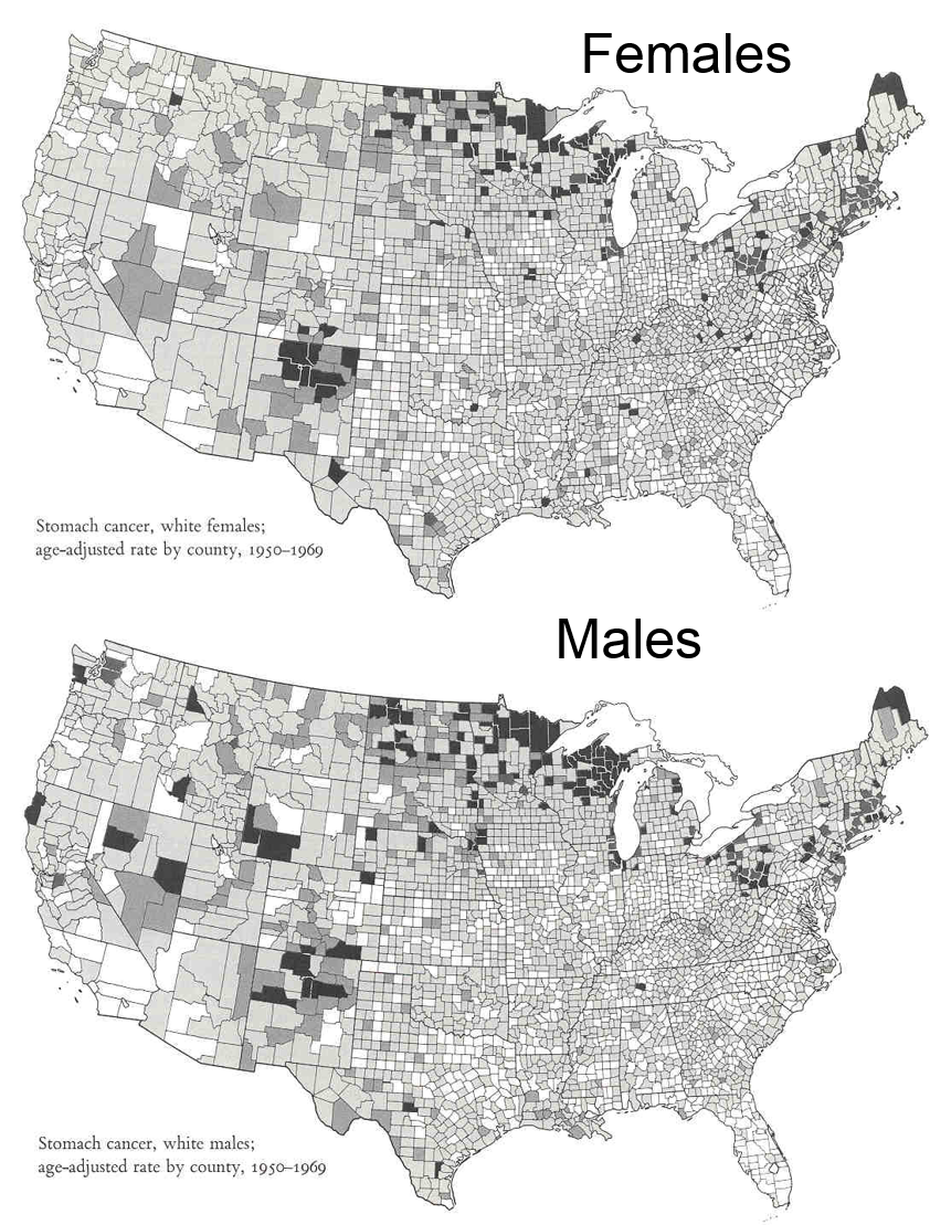
These maps summarize an enormous amount of information and present it efficiently, coherently, and effectively.in a way that invites the viewer to make comparisons and to think about the substance of the findings. Consider, for example, that the region to the west of the Great Lakes was settled largely by immigrants from Germany and Scand anavia, where traditional methods of preserving food included pickling and curing of fish by smoking. Could these methods be associated with an increased risk of stomach cancer?
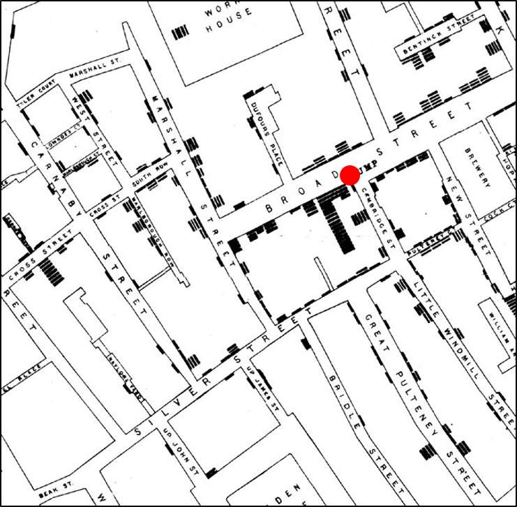
John Snow's Spot Map of Cholera Cases
Consider also the spot map that John Snow presented after the cholera outbreak in the Broad Street section of London in September 1854. Snow ascertained the place of residence or work of the victims and represented them on a map of the area using a small black disk to represent each victim and stacking them when more than one occurred at a particular location. Snow reasoned that cholera was probably caused by something that was ingested, because of the intense diarrhea and vomiting of the victims, and he noted that the vast majority of cholera deaths occurred in people who lived or worked in the immediate vicinity of the broad street pump (shown with a red dot that we added for clarity). He further ascertained that most of the victims drank water from the Broad Street pump, and it was this evidence that persuaded the authorities to remove the handle from the pump in order to prevent more deaths.
Humans can readily perceive differences like this when presented effectively as in the two previous examples. However, humans are not good at estimating differences without directly seeing them (especially for steep curves), and we are particularly bad at perceiving relative angles (the principal perception task used in a pie chart).
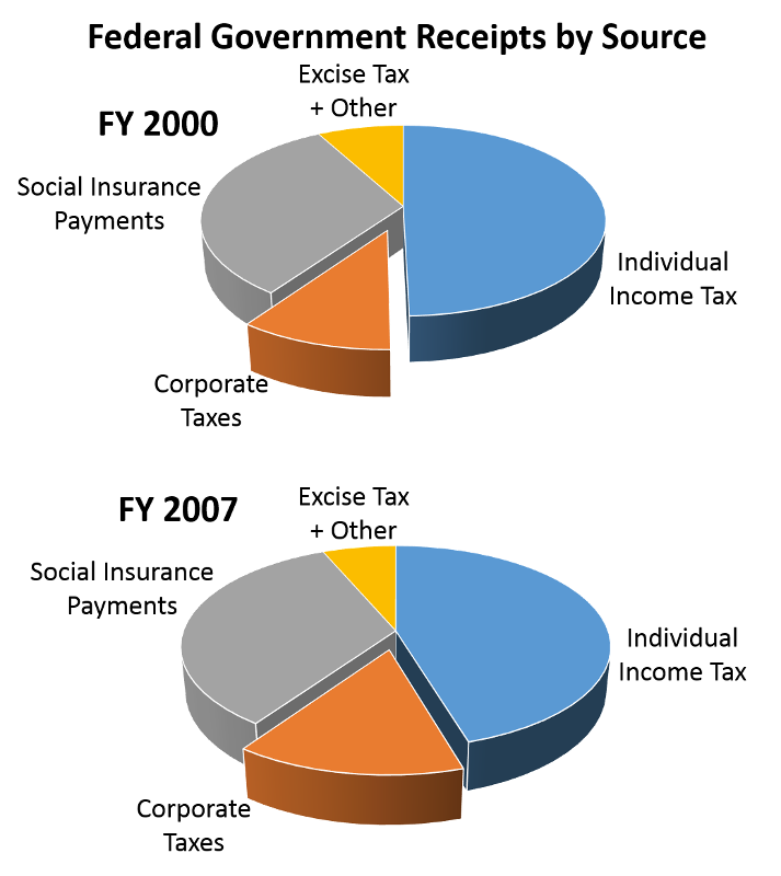
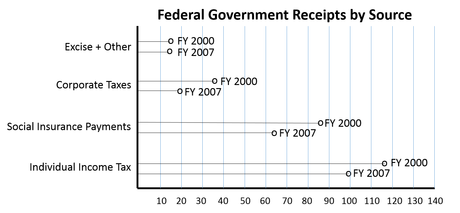
Pie Charts
The use of pie charts is generally discouraged. Consider the pie chart on the left below. It is difficult to accurately assess the relative size of the components in the pie chart, because the human eye has difficulty judging angles. The dot plot on the right shows the same data, but it is much easier to quickly assess the relative size of the components and how they changed from Fiscal Year 2000 to Fiscal Year 2007.
|
|
Adapted from Wainer H.:Improving data displays: Ours and the media's. Chance, 2007;20:8-15. Data from http://www.taxpolicycenter.org/taxfacts/displayafact.cfm?Docid=203 |
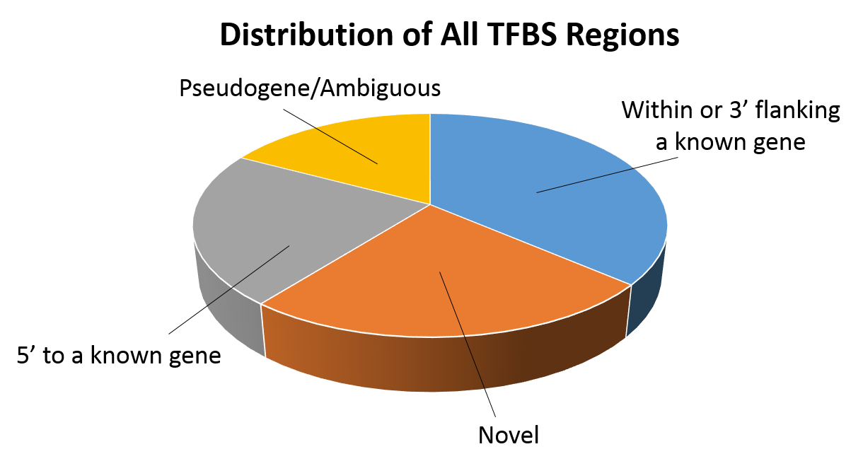
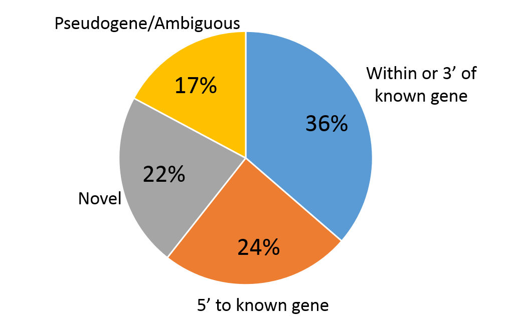
Consider the information in the two pie charts below (showing the same information).The 3-dimensional pie chart on the left distorts the relative proportions. In contrast the 2-dimensional pie chart on the right makes it much easier to compare the relative size of the varies components..
|
Adapted from Cawley S, et al. (2004) Unbiased mapping of transcription factor binding sites along human chromosomes 21 and 22 points to widespread regulation of noncoding RNAs. Cell 116:499-509, Figure 1 |
|
|