

Graphical Displays
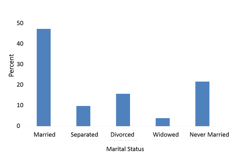
A bar chart indicates separate categories by spaces between the bars.
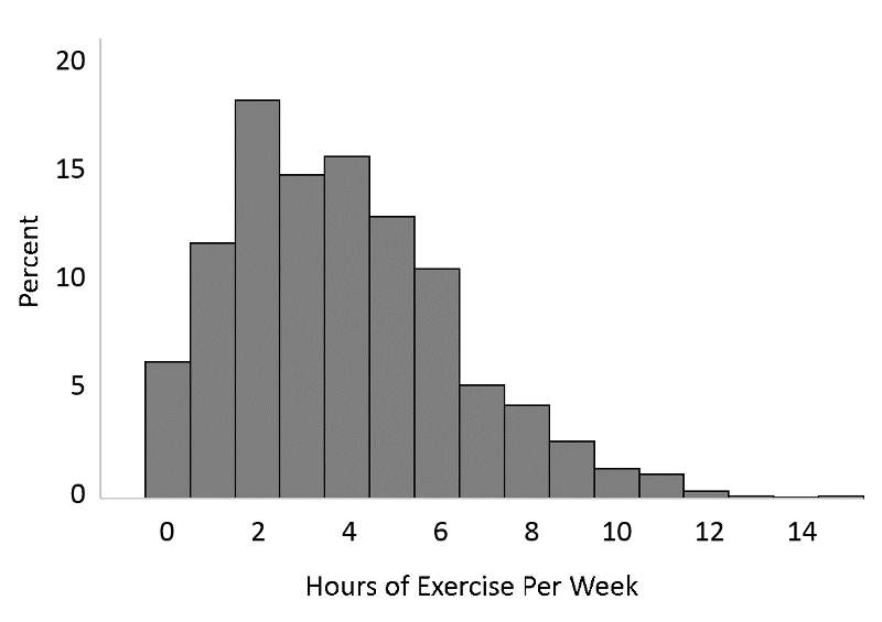
A histogram could be used for continuous variables, and it could also be used for the number of hours of exercise per week which one might think of as an ordinal variable, i.e., discrete, but ordered.
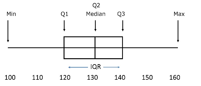
A box and whisker plot is a way of summarizing skewed data. It gives a sense of the shape of the distribution, the central tendency, and the degree of variability.
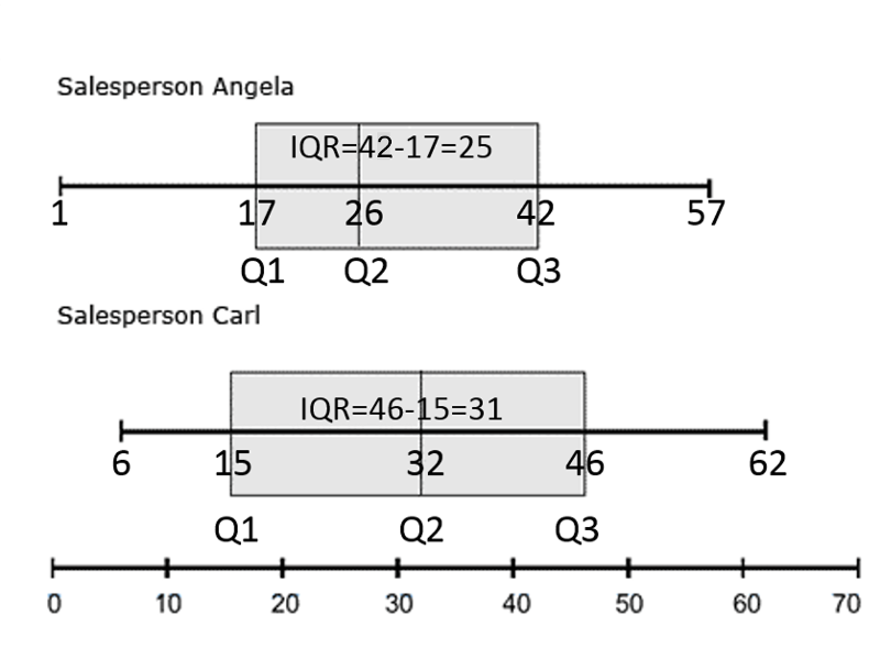
Example of Box and Whisker Plots Used for Comparison:
Carl and Angela work in a computer store and want to compare the number of sales they made for the past 12 months.
In the past 12 months Angela sold
34, 47, 1, 15, 57, 24, 20, 11, 19, 50, 28, 37
(Ordered: 1, 11, 15, 19, 20, 24, 28, 34, 37, 47, 50, 57)
In the past 12 months Carl sold
51, 17, 25, 39, 7, 49, 62, 41, 20, 6, 43, 13.
(Ordered: 6, 7, 13, 17, 20, 25, 39, 41, 43, 49, 51, 62)
After ordering the data, it can be summarized as follows:
(Image adapted from https://www.statcan.gc.ca/edu/power-pouvoir/ch12/5214889-eng.htm)
Carl's highest and lowest sales are both higher than Angela's, and Carl's median sales figure is higher too. During the past year, Carl consistently sold more computers than Angela.