


Standardization Using an External Distribution
Example #2: Calculating Age-adjusted Rates Using an External Age Distribution as the Standard (e.g., using the age distribution of the US population in 1988 as the standard age distribution.)
Table - Distribution of the US Population in 1988
|
Age Group |
Population (% of Total) |
|---|---|
|
<5 |
18,300,000 (7%) |
|
5-19 |
52,900,000 (22%) |
|
20-44 |
98,100,000 (40%) |
|
45-64 |
46,000,000 (19%) |
|
>64 |
30,400,000 (12%) |
|
Total |
245,700,000 (100%) |
Now, let's use the US population distribution in 1988 as the standard distribution for both Florida and Alaska:
Here are the age-specific death rates for Florida and Alaska:
|
Age Group |
Florida Death Rates per 100,000 |
Alaska Death Rates per 100,000 |
|---|---|---|
|
<5 |
284 |
274 |
|
5-19 |
57 |
65 |
|
20-44 |
198 |
188 |
|
45-64 |
815 |
829 |
|
>64 |
4425 |
4350 |
First, we will calculate the standardized rate for Florida by multiplying each of Florida's age-specific rates by the fraction of fraction of the age group in the standard population.
For the age group <5 years old: 0.07 x 284 = 19.88
For the age group 5 to 19 years: 0.22 x 57 = 12.54
For the age group 20 to 44 years: 0.40 x 198 = 79.20
For the age group 45 to 64 years: 0.19 x 815 = 154.85
For the age group greater than 64 year: 0.12 x 4,425 = 531.00
SUM = 797 per 100,000 population
Therefore, using the 1988 US population distribution as the standard, the standardized rate in Florida is 797 per 100,000 population, calculated.
Now let's use the standard population distribution to calculate Alaska's standardized rate by multiplying each of Alaskaa's age-specific rates by the fraction of fraction of the age group in the standard population.
For the age group <5 years old: 0.07 x 274 = 19.18
For the age group 5 to 19 years: 0.22 x 65 = 14.30
For the age group 20 to 44 years: 0.40 x 188 = 75.20
For the age group 45 to 64 years: 0.19 x 629 = 119.51
For the age group greater than 64 year: 0.12 x 4,350 = 522.00
SUM = 750 per 100,000 population
Using the 1988 US population distribution as the standard, the standardized rate in Alaska is 750 per 100,000 population, calculated by multiplying each of Alaska's age-specific rates by the fraction of fraction of the age group in the standard population.
Using the 1988 US population distribution as the standard gives different adjusted rates than when we used Florida as the standard, but the difference between the two states is almost identical to when we used Florida as the standard. Once again, note that the standardized rate ratio (SRR) = 797/750 = 1.06, i.e., much less than the crude mortality rate ratio of 2.68, but very close to the standardized rate ratio that was obtained when the age distribution of Florida was used as the standard.
These adjusted rates are hypothetical death rates that would have occurred in each state if each had the age distribution of the entire US population in 1988. It is important to note the the adjusted rates are artificial, because they are based on a hypothetical situation, and what one gets for the summary rates depends, to some extent, on what one selects as the standard. However, the more important observation is the impact on the comparison between the two populations. Both sets of weights provided age-standardized rates that showed there is little difference in mortality risk between the two states after adjusting for age.
Because rates can be compared only when weights are the same for each entity, basic public health data almost always use an external population to facilitate comparison with other entities. For example, to compare the mortality rates among all 50 U.S. states, it would make much more sense to use the U.S. population as a whole for the weights than weighting each state's population to Florida or any other state. This consideration carries over to the situation in which only two states are compared, or even when tracking trends over time in a single state, especially if over a time period long enough to see a change in the age distribution of the population.
Therefore, one would be much more likely to see a comparison between Florida and Alaska where the U.S. population was used as the standard (Example #2) than where the population of Florida was used (Example #1). Analogously, mortality rates among all the countries in the world typically use a world standard based population.
Currently, the age distribution of the population based on the 2000 Census is used for almost all measures in the United States, while the World Health Organization (WHO) has developed a standard population based on the average age distribution of the world's population
Standardized Rate Ratio
Summary of Standardized Rates
Standardization results in "adjusted" rates that are not real, but they have the advantage of enabling you to compare two or more populations after removing the distorting effect of other confounding factors, such as age. In many public health circumstances, it is important to compare rates of disease among two or more populations, but there may be differences in the distributions of the populations that distort the comparison. In this situation you will frequently see adjusted or standardized rates.
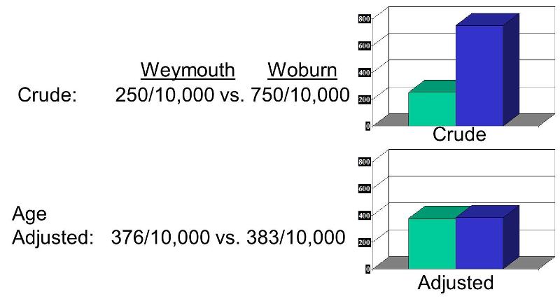
A comparison of crude and adjusted rates also provides a way to identify whether a factor is causing confounding. By definition, if you adjust for a factor like age and the relationship changes, then there was confounding. In the illustration below, Woburn's crude rate was 750 per 10,000 compared to Weymouth's crude rate of 250 per 10,000, a 3-fold difference. However, the age-adjusted rate for Woburn was 383 per 10,000, and the age-adjusted rate for Weymouth was 376 per 10,000. This indicates that the crude comparison was confounded by age.
One might ask "Why not just compare the age-specific rates?" The answer is that there are times when unconfounded summary rates are very useful. For example, suppose you wanted to examine trends in mortality rates for heart disease over time, and you wanted to also see how trends compared among black and white males and females. In this situation you might have age-, race-, and gender-specific rates at multiple time points in a single population. However, there would be so many category-specific rates that it would be impossible to keep track of all of the comparisons and make any sense out of what was going on, as illustrated in the following tables showing age-, gender-, and race-specific rates of mortality from heart disease over time.
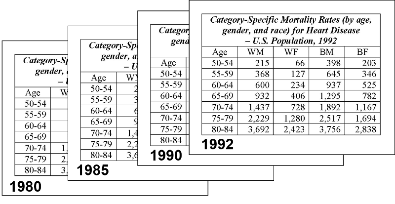
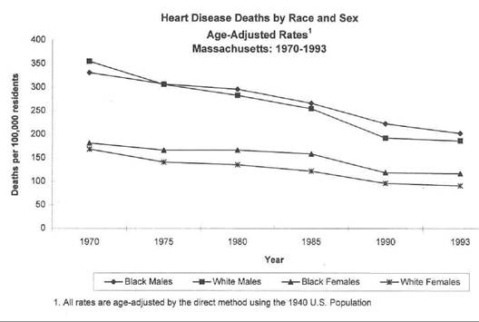
Trying to make sense out of all of these category-specific rates would be extremely difficult. On the other hand, if you calculated age-adjusted summary rates for black and white males and females for each year, you could then summarize these with a graph that allowed you to quickly see what the trends were, as illustrated below.
The video below provides a 20 min overview of standardized rates.
![]()
![]()