

Analysis of Categorical Data
For a continuous variable such as weight or height, the single representative number for the population or sample is the mean or median. For dichotomous data (0/1, yes/no, diseased/disease-free), and even for multinomial data—the outcome could be, for example, one of four disease stages—the representative number is the proportion, or percentage of one type of the outcome.
For example, 'prevalence' is the proportion of the population with the disease of interest. Case-fatality is the proportion of deaths among the people with the disease. The other related term is 'probability'. For dichotomous variables the proportion is used as the estimated probability of the event. In epidemiology, comparison of two proportions is more common than two means. This is mainly because a clinical or public health decision is often based on a dichotomous outcome and less on the level of difference of the mean values.
Exploratory Analysis with Tabular/Categorical Data
As we saw in the second module in this series, categorical data are often described in the form of tables. We used a number of commands to create tables of frequencies and relative frequencies for our data. Suppose we use the airqualityfull.csv dataset, which recorded daily readings of airquality values.
|
Variable Name |
Description |
|---|---|
|
Ozone |
Ozone (ppb) |
|
Solar.R |
Solar R (lang) |
|
Wind |
Wind (mph) |
|
Temp |
Temperature (degrees F) |
|
Month |
Month (1-12) |
|
Day |
Day (1-31) |
|
goodtemp |
"low" temp was less than 80 degrees, "high" temp was at least 80 degrees |
|
badozone |
"low" ozone was less than or equal to 60 ppb, "high" ozone was higher than 60 ppb |
First read in the data:
> aqnew <- read.csv("airquality.new.csv",header=TRUE, sep=",")
Do you recall what the following commands do? Let's do a little review:
> table(goodtemp)
> table(goodtemp,badozone)
> table(goodtemp,badozone,Month)
> ftable(goodtemp+badozone~Month)
> table.goodbad<-table(goodtemp, badozone)
> margin.table(table.goodbad,2) # here x is a matrix/data frame
> prop.table(table.goodbad,1) # here y is a matrix/data frame
> barplot(table.goodbad, beside=T, col="white", names.arg=c("high ozone","low ozone"))
Choosing the Best Type of Plot
With all the available ways to plot data with different commands in R, it is important to think about the best way to convey important aspects of the data clearly to the audience. Some situations to think about:
A) Single Categorical Variable
Use a dot plot or horizontal bar chart to show the proportion corresponding to each category. The total sample size and number of missing values should be displayed somewhere on the page. If there are many categories and they are not naturally ordered, you may want to order them by the relative frequency to help the reader estimate values.
#single variable
goodtemp.1<-ifelse(goodtemp=="low", 0, 1)
barplot(table(goodtemp.1), col=c("lightblue","darkred"),main="Low (0) vs. High (1) Temp",ylab="Count")
#...or horizontal:
barplot(table(goodtemp.1), col=c("lightblue","darkred"),main="Low (0) vs. High (1) Temp",ylab="Count",horiz=T)

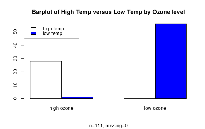
B) Categorical Response Variable vs. Categorical Independent Variable
This is essentially a frequency table, which can be depicted graphically (e.g., barplot)
#categorical response vs. categorical predictor
barplot(table.goodbad,beside=T,col=c("white","blue"), names.arg=c("high ozone","low ozone"), main="Barplot of High Temp versus Low Temp by Ozone level", sub="n=111, missing=0")
legend("topleft", legend=c("high temp", "low temp"),fill=c("white", "blue"))
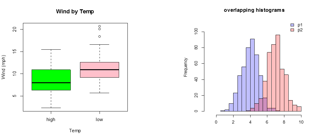
C) Continuous Response Variable vs. Categorical Independent Variable
If there are only two or three categories, consider box plots. Occasionally, a back-to-back histogram can be effective for two groups.
boxplot(Wind~goodtemp, xlab="Temp", ylab="Wind (mph)", main="Wind by Temp",col=c("green","pink"))
p1 <- hist(rnorm(450,4)) # centered at 4
p2 <- hist(rnorm(450,7)) # centered at 7
plot( p1, col=rgb(0,0,1,1/4), xlim=c(-1,10),ylim=c(0,110),xlab="",main="overlapping histograms")
plot( p2, col=rgb(1,0,0,1/4), xlim=c(-1,10),ylim=c(0,110), add=T)
legend('topright',c('p1','p2'),fill = c(rgb(0,0,1,1/4),rgb(1,0,0,1/4)), bty = 'n')
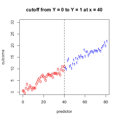
D) Categorical Response vs. a Continuous Independent Variable
Not so easy. A continuous plot with cutoff points? We will cover this more in the next module.
#continuous predictor, binary outcome...?
x1<-seq(0,40,1)
x2<-seq(41,81,1)
for(i in 1:41){
y1[i]<-(1/5)*x1[i]^(1/10)+(1/4)*x1[i]+rnorm(1,0,1)
y2[i]<-(1/5)*x2[i]^(1/10)+(1/4)*x2[i]+rnorm(1,0,1)
}
plot(x1,y1,pch="0",main="cutoff from Y = 0 to Y = 1 at x = 40",col="red",ylim=c(0,30),xlim=c(0,80),xlab="predictor",ylab="outcome")
points(x2,y2,pch="1",col="blue")
abline(v=40,lty=2)