Graphing
Graphing is a very useful tool for both interpreting data and communicating information to others. The use of shapes and lines makes relationships between data more clear, making trends or distribution easier to see. There are many different types of graphs, each best suited to particular types of data. Over the course of a semester, you will need to use graphs to complete various assignments. You will also encounter graphs in much of the reading assignments in any public health class.
Microsoft Excel is one convenient computer program (among many) for making graphs. The following is a description of several types of graphs and examples of when they may be useful. The University of Colorado has a useful tutorial on creating scatter plots in Excel shown in the video below.
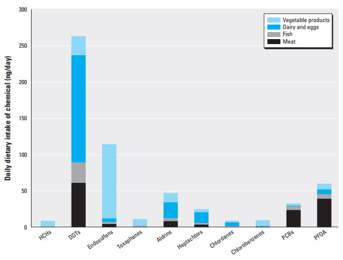
Bar charts
Bar charts are often used to compare two or more categories of data. For example, in the figure below, a bar chart is used to show an estimate of per capita dietary exposure to pesticides, PCBs, and PFOA based on USDA food availability data. From this graph, it is easy to see that for all of the chemicals measured, dietary intake is highest for DDTs, and the majority of this intake comes from consumption of dairy and eggs, followed by meat.
Source: Perfluorinated Compounds, Polychlorinated Biphenyls, and Organochlorine Pesticide Contamination in Composite Food Samples from Dallas, Texas, USA, Environmental Health Perspectives.
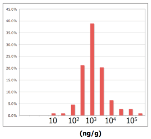
Histograms
Histograms are used to show the distribution of data. For example, the graph below shows the percent of samples with chemical concentrations of various amounts. Each bar represents a range of concentrations. Note that the x-axis is log base 10. You can tell that because each factor of ten uses the same distance on the x-axis.
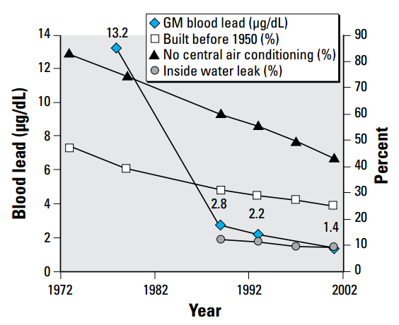
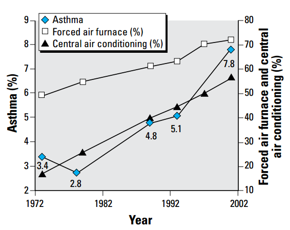
Line graphs
Line graphs are used to look at trends over time. The horizontal, or x-axis, is used to depict the independent variable, in this case, time. The vertical y-axis is used to graph the dependent variable, here percent asthma and concentration blood lead. Time can be expressed in units of hours, days, years or seasons - whatever is appropriate for the graph. You can also include more than one data set so that trends can be compared. For example, the graphs shown below illustrate the relationship between indicators of population health and certain housing characteristics.
Source: The Relationship of Housing and Population Health: A 30-Year Retrospective Analysis, Environmental Health Perspectives.
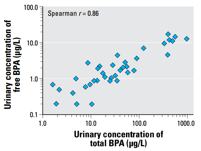
Scatter X-Y Graphs
Scatter plots are used to illustrate the relationship between two independent variables. The scatter pattern helps one visualize whether two variables are related or not, and a regression coefficient or correlation coefficient (r) provides a numerical value representing the extent to which the two variables are related. As shown, among 37 premature infants studied, urinary total BPA concentration and urinary free BPA concentration are highly correlated. Note that this graph plots the log (base 10) of the y variable vs the log of the x variable. You can tell it is a log-log plot because each factor of 10 is represented by the same distance.
Source: Exposure to Bisphenol A and Other Phenols in Neonatal Intensive Care Unit Premature Infants, Environmental Health Perspectives.
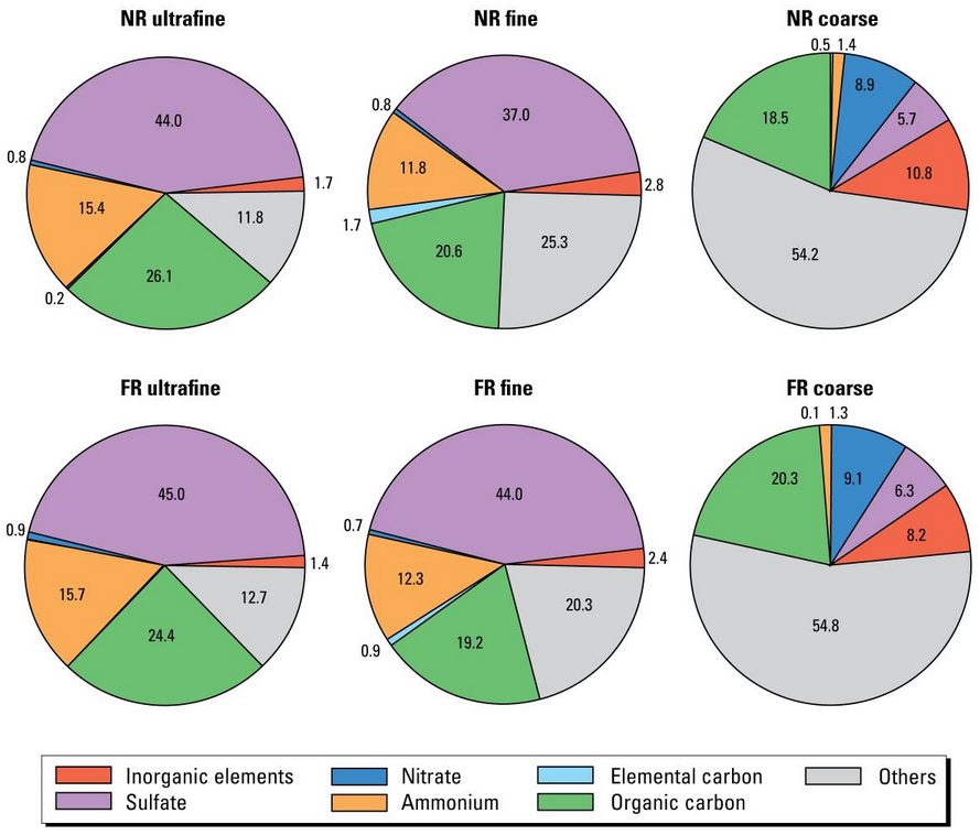
Pie Graphs
Pie graphs are usually used to show distribution as percentages of a whole. For example, if you wanted to compare sets of particulate matter data to illustrate the difference in how distance from a major road influences PM composition, you could use pie charts that break the whole pie (total PM) into slices representing different chemical compounds. The graphs below makes it easy to see the contribution of different classes of chemical compounds to PM composition for ultrafine, fine, and coarse particulates measured near (NR) and far (FR) from an interstate highway.
Source: Comparative Toxicity of Size-Fractionated Airborne Particulate Matter Collected at Different Distances from an Urban Highway, Environmental Health Perspectives.