

Summary
The first important aspect of any statistical analysis is an appropriate summary of the key analytic variables. This involves first identifying the type of variable being analyzed. This step is extremely important as the appropriate numerical and graphical summaries depend on the type of variable being analyzed. Variables are dichotomous, ordinal, categorical or continuous. The best numerical summaries for dichotomous, ordinal and categorical variables involve relative frequencies. The best numerical summaries for continuous variables include the mean and standard deviation or the median and interquartile range, depending on whether or not there are outliers in the distribution. The mean and standard deviation or the median and interquartile range summarize central tendency (also called location) and dispersion, respectively. The best graphical summary for dichotomous and categorical variables is a bar chart and the best graphical summary for an ordinal variable is a histogram. Both bar charts and histograms can be designed to display frequencies or relative frequencies, with the latter being the more popular display. Box-whisker plots provide a very useful and informative summary for continuous variables. Box-whisker plots are also useful for comparing the distributions of a continuous variable among mutually exclusive (i.e., non-overlapping) comparison groups.
The following table summarizes key statistics and graphical displays organized by variable type.
|
Variable Type |
Statistic |
Definition |
|---|---|---|
|
Dichotomous, Ordinal or Categorical |
Relative Frequency |
f/n |
|
Dichotomous or Categorical |
Frequency or Relative Frequency Bar Chart |
|
|
Frequency or Relative Frequency Histogram |
|
|
Continuous |
Mean |
|
|
Standard Deviation |
|
|
|
Median |
Middle value in ordered data set |
|
|
First Quartile
Third Quartile |
Q1=Value holding 25% at or below it Q3=Value holding 25% at or above it |
|
|
Interquartile Range |
Q3- Q1 |
|
|
Criteria for Outliers |
Values below Q1-1.5(Q3-Q1) or above Q3+1.5(Q3-Q1) |
|
|
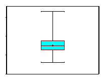
Box-Whisker Plot |
|