
Using Spreadsheets in Public Health
Excel (PCs) and Numbers (Mac & iPad)
Spreadsheets are very useful tools in public health because they are widely available, and can be used for collecting data, statistical analysis, constructing graphs and tables which can be exported into other applications or converted into image files. The basic function of Excel spreadsheets (for PCs) and Numbers (for Mac and iPad) is similar; they all consist of a matrix of rows (1, 2, 3, 4, etc.) and columns (A, B, C, ... Z, AA, AB, AB, etc.) which can be used to store text or numeric data and to perform a wide variety of mathematical and other functions that greatly facilitate analysis, organization, and reporting.
However, there are differences between Excel and Numbers in the user interface and the menus, and there are also differences among different versions of Excel. Nevertheless, the basic layout and functions within all of these are quite similar, and it is also noteworthy that Excel spreadsheets will open and run in Numbers, and Numbers spreadsheets can be "Saved as" Excel spreadsheets.
This tutorial will provide videos that illustrate the user interface for various versions of Excel and for Numbers '09. These will introduce users to whichever version of Excel or Numbers they have. The examples that we have developed to illustrate the application of spreadsheets in public health practice have been created in Excel, but the example spreadsheets can be downloaded and opened in whichever spreadsheet application you are using, and the examples are more or less generic and should be easily adapted to the spreadsheet you are using.
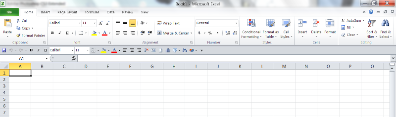
The figure below shows and empty spreadsheet in Excel 2010. The top rows show the main menu elements (File, Home, Insert, etc.), and beneath that is a toolbar which provides quick access to a number of commonly used tools. The bottom of the figure shows the matrix of columns and rows that comprise the actual spreadsheet. This window shows just a tiny fraction of the available spreadsheet. The columns are labeled with letters, and if we scrolled to the right, we would see that once one gets to column "Z", the columns continue with "AA", "AB", etc. to provide an enormous number of columns all the way to "XFD". Similarly, there are many available rows numbered 1 through 1,048,756. This large area makes it possible to story large amounts of data in tabular form.
This video provides a short orientation to the Excel 2010 spreadsheet how to move around within it.. Topics include:
The menus in previous versions will be different from these, but navigation and other design aspects will be the same.
This video illustrates:
To view the video in full screen mode, click on the icon at the very lower right, next to "You Tube".
|
Name |
Age |
Weight (lbs) |
Height (in) |
Weight (kg) |
Height (meters) |
BMI (kg/m2) |
|
Joe |
45 |
272 |
72 |
|
|
|
|
Jane |
37 |
165 |
65 |
|
|
|
|
Sarah |
55 |
223 |
64 |
|
|
|
|
Tom |
61 |
201 |
62 |
|
|
|
|
Ayesha |
48 |
193 |
68 |
|
|
|
|
Sally |
41 |
289 |
63 |
|
|
|
|
Dorothy |
29 |
213 |
70 |
|
|
|
|
James |
38 |
188 |
66 |
|
|
|
The worksheets at the bottom of your screen have titles. The default names are "Sheet 1", "Sheet 2," etc. You can change the names by double-clicking on the worksheet title to select it, and then typing in a new name.
=D2*2.54/100
This should give a result of 1.8288 meters.
=E2/(F2^2)
You should get a BMI of 36.89. Note also that the cell is already formatted to two decimal places.
Note also that the parentheses around (F2^2) are critical, since they indicate that the value of F2 (meters) should first be squared (i.e., raised to the second power), and the result should then be divided into E2.
In cells A11 through A15 enter the following labels: Count, Sum, Average, Std. Deviation, Median.
In cell B11 enter the function "=COUNT(B2:B9)".
In cell B12 enter the function "=SUM(B2:B9)"
In cell B13 enter "=AVERAGE(B2:B9)".
In cell B14 enter "=STDEV.S(B2:B9)".
In cell B15 enter "=MEDIAN(B2:B9)".
Now replicate these functions to the right in order to apply them to columns C through G.
Now select rows 12-15 and format them to one decimal place.
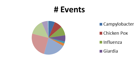
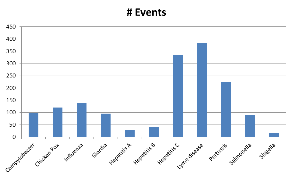
In the handouts on the right side of the page there is a link to a spreadsheet called "MAVEN data set." This contains de-identified data from MAVEN (the Massachusetts Virtual Epidemiologic Network), which is used for surveillance of infectious diseases.
The lower portion of the first worksheet lists partial data for over 1,500 cases of infectious disease reported to MAVEN. (For simplicity, the data set you see contains some of the more common infectious diseases). Note that I have already sorted the data by type of infection.
In the uppermost portion of the spreadsheet I have created a summary table that uses the "COUNT" function to count the number of cases of each type of infection.
Your charts should look something like the ones below:
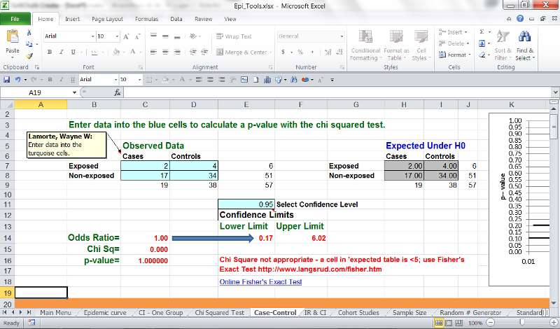
In the handouts on the right side of this page, the Excel file called "Epi_Tools.XLS" has two worksheets, each demonstrating a simple way to create an epidemic curve when you have dates of onset for a series of cases. The first method, simply sorting the cases by date of onset and then counting the number of cases occurring at, say, two day intervals, is illustrated in the worksheet called "Epi Curve 1". The second method, using pivot tables, is illustrated in the worksheet called "Epi Curve 2".
In the handouts on the right side, open the Excel file call "Hepatitis Outbreak". Save this file to your local computer or thumb drive.
This file contains actual data from investigation of a hepatitis outbreak that occurred in Marshfield, MA in 2004. There were 20 cases reported within a short period of time. The Massachusetts Department of Public Health was asked to investigate the outbreak. Descriptive epidemiology, including hypothesis-generating interviews, suggested that the source was most likely a food handler at one of several possible food establishments.
The investigators conducted a case-control study. They created a questionnaire and collected data from 19 cases and 38 controls. The controls were matched to the cases by age group and by neighborhood of residence. The data is in the first worksheet in the Excel file above. Note that the data indicating whether the subjects were cases or control are inconsistent, with a variety of responses indicating yes or no. The same is true for the data indicating which food establishments they were exposed to.
You now have the information you need to compute odds ratios and 95% confidence intervals for each of the food establishments.
Is there an association between High Density Lipoprotein Cholesterol (HDLC) levels and myocardial infarction?
In Handouts on the right-hand side of the spreadsheet module there is an Excel file with actual data from the Framingham Heart Study. In this data set there a variable called labeled HDLC in column R. This is the subject's value for high density lipoprotein cholesterol at the beginning of the study (baseline). HDLC is sometimes called the 'good' cholesterol, because higher levels of HDLC seem to be associated with a lower risk of atherosclerotic heart disease. [For more on lipoproteins and heart disease see the discussion of this topic in the PH709 module on Atherosclerosis]
In this analysis you will examine the association between low HDLC (i.e. values < 40) and risk of myocardial infarction. In the spreadsheet with the Framingham data set there is a variable called MI_FCHD in column W which indicates whether the subject was hospitalized for a myocardial infarction or died of a myocardial infarction during this phase of the study. This is the outcome of interest for this particular analysis. TIMEMIFC in column AD indicates the disease free observation time (in days) for having a fatal or non-fatal myocardial infarction (heart attack). This time represents the number of days elapsed from baseline until one of three things happened: 1) they had a myocardial infarction, 2) they were lost to follow-up, or 3) the subject reached the last date for this phase of the study without an event. Note that many subjects have 8,766 days of TIMEMIFC; these are all subjects who had the maximum number of observation days because they were observed from baseline until the end of this phase of the study (8.766) and did not have a myocardial infarction during that entire period.
This is a 21 minute video which walks you through a similar analysis comparing the risk of myocardial infarction between subjects with high LDL (> 130) and low LDL (<130). This will provide detailed instructions on performing an analysis in a cohort study.
Detailed Instructions:
Open the Framingham data set in the Handouts section of the online module and save it to your computer using "File", "Save as". Then analyze the association between low HDLC (HDLC <40) and myocardial infarction (MI_FCHD). Compute BOTH the cumulative incidence and the incidence rates in the exposed and unexposed groups. Use these results to compute the Risk Ratio (using cumulative incidence) and the Rate Ratio (using the incidence rates).
Note: if there are individuals who do not have a recorded value for HDLC, these subjects should be excluded from the analysis.]
You will need to compute:
With this information complete your analysis by using the Cohort Study worksheet in Epi_Tools.xls to compute the
Finally, using the Excel data file that you used to sort and tabulate the data, insert a text box that summarizes the results of your analysis, and interpret your findings in a few sentences. Label the summary worksheet tab as "Summary."
The Smart Method - Free Online Video Course with 302 video tutorials
http://www.youtube.com/user/TheSmartMethod?feature=watch1-1 Start Excel & check your program version 9:03
(From YouTube.com; http://www.youtube.com/watch?v=eI_7oc-E3h0
(From YouTube;
http://www.youtube.com/watch?v=JJPjs-lITAwFrom YouTube;
(From YouTube;
http://www.youtube.com/watch?v=8r4Cs4Iay3o
(From Microsoft.com)
The IF function checks to see if a condition you specify is true, or false. If true, one thing happens; if false, something else happens. For example, if you use the IF function to see if amounts spent are under or over budget, the result for True could be "Within budget," while the result for False could be "Over budget."
Download | Watch online
(From YouTube; http://www.youtube.com/watch?v=SNbxFSMRw6g
From YouTubel
http://www.youtube.com/watch?v=iNrhjFixC28
(From Microsoft.com)
Charts make data visual. With a chart you can transform spreadsheet data to show comparisons, patterns, and trends.
Download | Watch online
(Note Before watching the video, download the Beach Inspections spreadsheet and save it to your own computer. Right-click on this Link to Example Spreadsheet, and select 'Save target as'.)
(Note: Before watching the video, download the IgG Dose Calculation spreadsheet and save it to your own computer. Right-click on this Link to example spreadsheet, and select 'Save target as'.
Additional Formatting Tips
(Note: Before watching the video, download the PneumoVaccines spreadsheet and save it to your own computer. Right-click on this Link to example spreadsheet, and select 'Save target as'.
(Note: Before watching the video, download the GreaseTraps spreadsheet and save it to your own computer. Right-click on this Link to example spreadsheet, and select 'Save target as'.
(Note: Before watching the video, download the PneumoVaccines spreadsheet and save it to your own computer. Right-click on this Link to example spreadsheet, and select 'Save target as'.
(Note: Before watching the video, download the Hepatitis Outbreak spreadsheet and save it to your own computer. Right-click on this Link to example spreadsheet, and select 'Save target as'.
Description of the layout How to accomplish everyday tasks in Excel 2007, and a bit about the XML file formats. Get to know Excel 2007: Create your first workbook
How to create a workbook, enter and edit text and numbers, and add rows or columns Get to know Excel 2007: Enter formulas
How to enter simple formulas into worksheets, and how to make formulas update their results automatically Learn how to figure out dates using formulas in Excel 2007
How to find the number of days between dates, or the date after a number of workdays, or the date after a number of days, months, or years Charts I: How to create a chart in Excel 2007
How to create a chart using the new Excel 2007 commands and make changes to a chart after you create it Pivottables in EXCEL 2007
How pivottable reports organize, summarize, and analyze data. how to create a pivottable
Getting up to speed with Excel 2007
The layout of the 2007 spreadsheet, everyday tasks, and an explanation of the XML file formats Get to know Excel 2007: Create your first workbook
How to create a workbook, enter and edit text and numbers, and add rows or columns Get to know Excel 2007: Enter formulas
How to enter simple formulas into worksheets, and how to make formulas update their results automatically Learn how to figure out dates using formulas in Excel 2007
How to find the number of days between dates, or the date after a number of workdays, or the date after a number of days, months, or years
Charts I: How to create a chart in Excel 2007
How to create a chart using the new Excel 2007 commands and make changes to a chart after you create it Pivot Tables I:
How pivot tables organize, summarize and analyze data PivotTable II: Filter PivotTable report data in Excel 2007
How to filter to hide and display selected data in PivotTable reports PivotTable III: Calculate data in PivotTable reports in Excel 2007
Power tools: how to summarize data by using summary functions other than SUM, such as COUNT and MAX. How to show data as a percentage of the total by using a custom calculation. How to create your own formulas in PivotTable reports.
"Numbers" is the spreadsheet application for Apple devices. It functions much like Excel, but there are some differences. Note also that Excel spreadsheets will open and run in Numbers, and Numbers spreadsheets can be "Saved as" Excel spreadsheets.
Here is a list of hyperlinks to tutorials on specific aspects of Numbers
Numbers Help
Get started in Numbers
Numbers at a glance
Create a new spreadsheet
Open an existing spreadsheet
Replace template placeholders
Organize a spreadsheet with sheets
Customize your app
Undo or redo changes
Use Handoff with Numbers
Add and edit tables
Add or delete tables
Work with rows and columns
Add content to table cells
Format table cells
Create a custom cell format
Add controls to cells
Merge or unmerge cells
Add a comment to a cell
Add conditional highlighting to cells
Change the look of a table
Change the look of table text
Save a table as a new style
Move, resize, and lock a table
Format tables for bidirectional text
Sort data in a table
Filter data
Enter formulas and functions
Calculations
Types of arguments and values
Ways to use the string operator and wildcards
Functions that accept conditions and wildcards as arguments
Add and edit charts
Add or delete a chart
Scatter charts and bubble charts
Interactive charts
Move, resize, and rotate a chart
Modify chart data
Adjust a chart's markings and labels
Change a chart's type
Change the look of a chart
Save and organize chart styles
Add images, shapes, and media
Objects overview
Add and edit images
Add and edit shapes
Add video and audio
Change the look of an object
Create object styles
Resize, rotate, and flip an object
Align and position objects
Layer, group, and lock objects
Add, edit, and format text
Add text
Change the look of text
Use paragraph styles
Align text
Format lists
Adjust character spacing and formatting
Format punctuation
Add color or a border to a text box
Check spelling
Find and replace text
Add comments and highlight text
Use bidirectional text
Format Chinese, Japanese, or Korean text
Manage spreadsheets
Save and rename a spreadsheet
Locate a spreadsheet
Save a spreadsheet in another format
Save a spreadsheet in package or single-file format
Lock a spreadsheet
Password-protect a spreadsheet
Add custom templates
Move a spreadsheet
Delete a spreadsheet
Share and print
Use iCloud with Numbers
Share and edit a spreadsheet with others
Send a copy of a spreadsheet
Print a spreadsheet
Use iTunes to transfer files
Share files over a remote server
Formulas and Functions Help
Formulas
Functions
Date and time functions
Duration functions
Engineering functions
Financial functions
Logical and information functions
Numeric functions
Reference functions
Statistical functions
Text functions
Trigonometric functions
There are also many You Tube video tutorials for Numbers.
This page provides links to Excel files which contain multiple worksheets that enable you to perform a wide variety of statistical functions and tests. To use these, you must open them and then save them on your local computer.
Summarizing Data
Generates summary statistics on a continuous variable
Confidence Interval Estimates
Worksheets compute confidence intervals for means, proportions, the mean difference in matched or paired samples, and the difference in means and difference in proportions in two independent samples and accept either raw data or summary statistics.
Hypothesis Testing Procedures
Worksheets conduct tests of hypothesis for means, proportions, the mean difference in matched or paired samples, and the difference in means and difference in proportions in two independent samples and accept either raw data or summary statistics.
ANOVA
Worksheets conduct analysis of variance tests of equality of k independent means and accept either raw data or summary statistics.
Chi-Square Tests
Worksheets conduct the chi-square goodness of fit and chi-square test of independence based on observed frequencies.
Sample Size Determination
Worksheets estimate the sample size(s) required to ensure adequate precision in confidence intervals or high power in tests of hypothesis for means, proportions, the mean difference in matched or paired samples, and the difference in means and difference in proportions in two independent samples.