PH717 Module 9 - Correlation and Regression
Evaluating Association Between Two Continuous Variables
Link to video transcript in a Word file
In this module we will continue our study of measurement variables, but instead of comparing means between groups, we will provide tools for examining the association between two variables with continuous distributions, i.e., correlations. The association between two such variables can be described mathematically with simple linear regression if the association is reasonably linear. Simple linear regression is a useful tool, and it also provides a foundation for the multiple regression methods that will enable you to evaluate and adjust for confounding variables in a later module.
In this module we will consider when correlation is appropriate and how to interpret correlation coefficients. We will also discuss the assumptions of the linear regression mode and how to interpret slope, confidence interval for the slope, p-value for the slope, and R2. To apply our learning, we will perform correlation and regression analyses and create scatter plots using R.
Essential Questions
After completing this section, you will be able to:
Does the number of hours of TV viewing as a child correlate with (i.e., predict) adult health outcomes, such as BMI, aerobic power, blood cholesterol level, or blood pressure? RJ Hancox and colleagues addressed this question in the study described in the abstract below.
Association between child and adolescent television viewing and adult health: a longitudinal birth cohort study. Hancox RJ, et al.: Lancet. 2004;64(9430):257-62.
Abstract
"BACKGROUND: Watching television in childhood and adolescence has been linked to adverse health indicators including obesity, poor fitness, smoking, and raised cholesterol. However, there have been no longitudinal studies of childhood viewing and adult health. We explored these associations in a birth cohort followed up to age 26 years.
METHODS: We assessed approximately 1000 unselected individuals born in Dunedin, New Zealand, in 1972-73 at regular intervals up to age 26 years. We used regression analysis to investigate the associations between earlier television viewing and body-mass index, cardiorespiratory fitness (maximum aerobic power assessed by a submaximal cycling test), serum cholesterol, smoking status, and blood pressure at age 26 years.
FINDINGS: Average weeknight viewing between ages 5 and 15 years was associated with higher body-mass indices (p=0.0013), lower cardiorespiratory fitness (p=0.0003), increased cigarette smoking (p<0.0001), and raised serum cholesterol (p=0.0037). Childhood and adolescent viewing had no significant association with blood pressure. These associations persisted after adjustment for potential confounding factors such as childhood socioeconomic status, body-mass index at age 5 years, parental body-mass index, parental smoking, and physical activity at age 15 years. In 26-year-olds, population-attributable fractions indicate that 17% of overweight, 15% of raised serum cholesterol, 17% of smoking, and 15% of poor fitness can be attributed to watching television for more than 2 hr. a day during childhood and adolescence.
INTERPRETATION: Television viewing in childhood and adolescence is associated with overweight, poor fitness, smoking, and raised cholesterol in adulthood. Excessive viewing might have long-lasting adverse effects on health."
Notice that the exposure (hours of TV viewing) and the outcomes in this study are both continuous measures. Chi-square tests could have been used if the investigators had categorized TV viewing (e.g., none, little, moderate, high) and also categorized the outcomes (e.g., obese or not), but they used continuous variables for both the exposure of interest and for the various outcomes, so we will need a different tool for assessing these data.
When looking for a potential association between two measurement variables, we can begin by creating a scatter plot to determine whether there is a reasonably linear relationship between them. The possible values of the exposure variable (i.e., predictor or independent variable) are shown on the horizontal axis (the X-axis), and possible values of the outcome (the dependent variable) are shown on the vertical axis (the Y-axis).
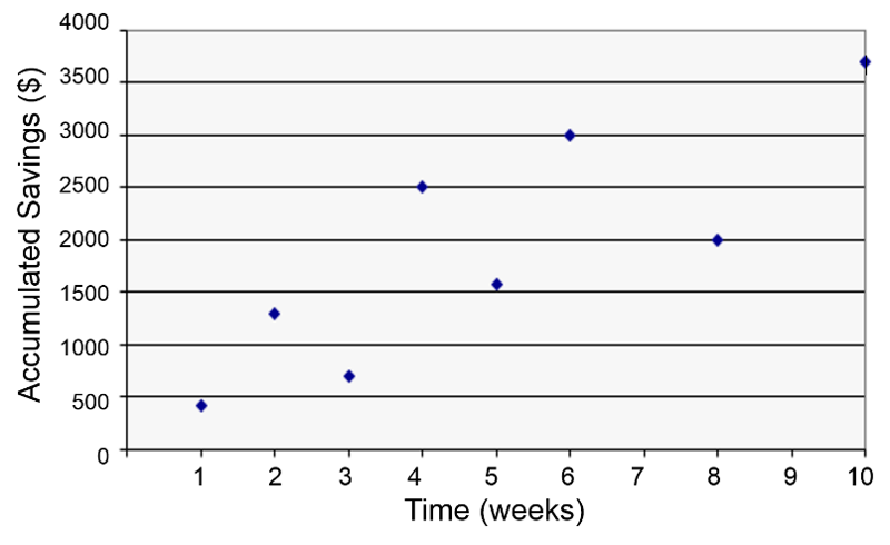
In the hypothetical example below an individual's accumulated savings over time are plotted as a function of time in weeks. There is some scatter to the data points, but there is the general sense that the overall trend is a linear increase over time. We might ask how closely the accumulation of savings correlates with time or ask about the average savings per week, and we might also ask about the probability that the apparent relationship is just the result of random error (chance).
In fact, we can answer these questions by using correlation analysis and simple linear regression analysis, as illustrated in the graph below.
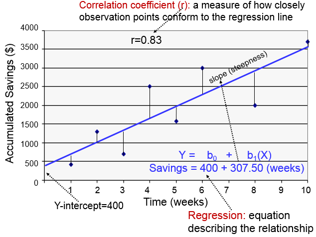
The regression line is determined from a mathematic model that minimizes the distance between the observation points and the line. How closely the individual observation points conform to the regression line is measured by the correlation coefficient ("r"). The steepness of the line is the slope, which is a measure of how many units the Y-variable changes for each increment in the X-variable; in this case the slope provides an estimate of the average weekly increase in savings. Finally, the Y-intercept is the value of Y when the X value is 0; one can think of this as a starting or basal value, but it is not always relevant. In this case, the Y-intercept is $400 suggesting that this individual had that much in savings at the beginning, but this may not be the case. She may have had nothing, but saved a little less than $500 after one week.
Notice also that with this kind of analysis the relationship between two measurement variables can be summarized with a simple linear regression equation, the general form of which is:
where b0 is the value of the Y-intercept and b1 is the slope or coefficient. From this model one can make predictions about accumulated savings at a particular point in time by specifying the time (X) that has elapsed. In this example, the equation describing the regression is:
SAVINGS=400 + 307.50 (weeks)
If I wanted to predict how much money had been saved after 5 weeks, I could substitute X=5 for the number of weeks as follows: SAVINGS = 400 + 307.50(5)= $1.937.50. Note that this is a bit more than the actual savings at that time.
The sample correlation coefficient (r) is a measure of the closeness of association of the points in a scatter plot to a linear regression line based on those points, as in the example above for accumulated saving over time. Possible values of the correlation coefficient range from -1 to +1, with -1 indicating a perfectly linear negative, i.e., inverse, correlation (sloping downward) and +1 indicating a perfectly linear positive correlation (sloping upward).
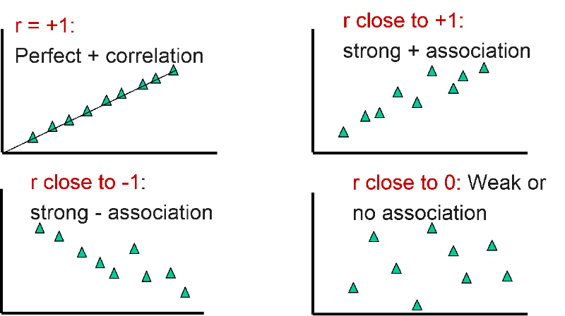
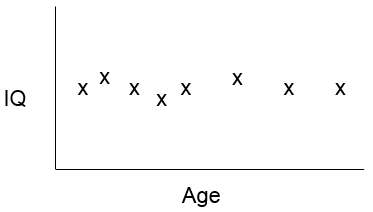
A correlation coefficient close to 0 suggests little, if any, correlation. The scatter plot suggests that measurement of IQ do not change with increasing age, i.e., there is no evidence that IQ is associated with age.
The equations below show the calculations sed to compute "r". However, you do not need to remember these equations. We will use R to do these calculations for us. Nevertheless, the equations give a sense of how "r" is computed.

where Cov(X,Y) is the covariance, i.e., how far each observed (X,Y) pair is from the mean of X and the mean of Y, simultaneously, and and sx2 and sy2 are the sample variances for X and Y.
. Cov (X,Y) is computed as:
You don't have to memorize or use these equations for hand calculations. Instead, we will use R to calculate correlation coefficients. For example, we could use the following command to compute the correlation coefficient for AGE and TOTCHOL in a subset of the Framingham Heart Study as follows:
> cor(AGE,TOTCHOL)
[1] 0.2917043
The table below provides some guidelines for how to describe the strength of correlation coefficients, but these are just guidelines for description. Also, keep in mind that even weak correlations can be statistically significant, as you will learn shortly.
| Correlation Coefficient (r) | Description (Rough Guideline ) |
|---|---|
| +1.0 | Perfect positive + association |
| +0.8 to 1.0 | Very strong + association |
| +0.6 to 0.8 | Strong + association |
| +0.4 to 0.6 | Moderate + association |
| +0.2 to 0.4 | Weak + association |
| 0.0 to +0.2 | Very weak + or no association |
| 0.0 to -0.2 | Very weak - or no association |
| -0.2 to – 0.4 | Weak - association |
| -0.4 to -0.6 | Moderate - association |
| -0.6 to -0.8 | Strong - association |
| -0.8 to -1.0 | Very strong - association |
| -1.0 | Perfect negative association |
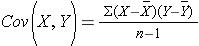
The four images below give an idea of how some correlation coefficients might look on a scatter plot.
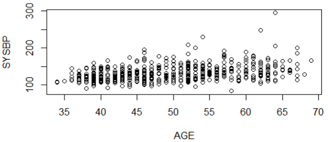
The scatter plot below illustrates the relationship between systolic blood pressure and age in a large number of subjects. It suggests a weak (r=0.36), but statistically significant (p<0.0001) positive association between age and systolic blood pressure. There is quite a bit of scatter, but there are many observations, and there is a clear linear trend.
How can a correlation be weak, but still statistically significant? Consider that most outcomes have multiple determinants. For example, body mass index (BMI) is determined by multiple factors ("exposures"), such as age, height, sex, calorie consumption, exercise, genetic factors, etc. So, height is just one determinant and is a contributing factor, but not the only determinant of BMI. As a result, height might be a significant determinant, i.e., it might be significantly associated with BMI but only be a partial factor. If that is the case, even a weak correlation might have be statistically significant if the sample size is sufficiently large. In essence, finding a weak correlation that is statistically significant suggests that that particular exposure has an impact on the outcome variable, but that there are other important determinants as well.
Many relationships between measurement variables are reasonably linear, but others are not For example, the image below indicates that the risk of death is not linearly correlated with body mass index. Instead, this type of relationship is often described as "U-shaped" or "J-shaped," because the value of the Y-variable initially decreases with increases in X, but with further increases in X, the Y-variable increases substantially. The relationship between alcohol consumption and mortality is also "J-shaped."
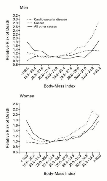
Source: Calle EE, et al.: N Engl J Med 1999; 341:1097-1105
A simple way to evaluate whether a relationship is reasonably linear is to examine a scatter plot. To illustrate, look at the scatter plot below of height (in inches) and body weight (in pounds) using data from the Weymouth Health Survey in 2004. R was used to create the scatter plot and compute the correlation coefficient.
wey<-na.omit(Weymouth_Adult_Part)
attach(wey)
plot(hgt_inch,weight)
cor(hgt_inch,weight)
[1] 0.5653241
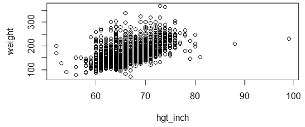
There is quite a lot of scatter, and the large number of data points makes it difficult to fully evaluate the correlation, but the trend is reasonably linear. The correlation coefficient is +0.56.
Note also in the plot above that there are two individuals with apparent heights of 88 and 99 inches. A height of 88 inches (7 feet 3 inches) is plausible, but unlikely, and a height of 99 inches is certainly a coding error. Obvious coding errors should be excluded from the analysis, since they can have an inordinate effect on the results. It's always a good idea to look at the raw data in order to identify any gross mistakes in coding.
After excluding the two outliers, the plot looks like this:
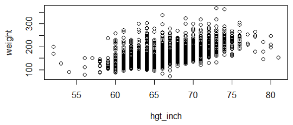
Note on the scatter plot above that each circle on the plot represents the X,Y pair of variables height and weight. The correlation coefficient is r=0.57. This is clearly not a perfect correlation, but remember that there are many other factors besides height that can affect one's weight, such as genetic factors, age, diet, and exercise. A variable might be a weak, but significant predictor if it is just one of many factors that determine the outcome (Y). Whether height is a statistically significant predictor of weight depends on both the strength of the correlation coefficient and the number of observations (n).
The null hypothesis for a correlation is that there is no correlation, i.e., r=0. We can evaluate the statistical significance of a correlation using the following equation:
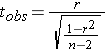
with degrees of freedom (df) = n-2
The key thing to remember is that the t statistic for the correlation depends on the magnitude of the correlation coefficient (r) and the sample size. With a large sample, even weak correlations can become statistically significant.
Having said that, you need not memorize this equation, and you will not be asked to do hand calculations for the correlation coefficient in this course. Instead, we will use R.
Example:
Let's examine the correlation between age (AGE) and total serum cholesterol (TOTCHOL) in the dataset FramHSn500.CSV, a subset of 500 subjects from the Framingham Heart Study. The scatter plot is shown below:
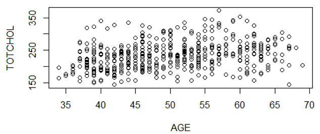
There is a lot of scatter, but there appears to be a general linear trend.
We can compute the correlation coefficient:
> cor(AGE,TOTCHOL)
[1] 0.2917043
We can also get the correlation coefficient and conduct the test of significance simultaneously by using the "cor.test" command:
> cor.test(AGE,TOTCHOL)
Pearson's product-moment correlation
data: AGE and TOTCHOL
t = 6.8056, df = 498, p-value = 2.9e-11
alternative hypothesis: true correlation is not equal to 0
95 percent confidence interval:
0.2093693 0.3699321
sample estimates:
cor
0.2917043
This output provides the correlation coefficient, the t-statistic, df, p-value, and the 95% confidence interval for the correlation coefficient.
Notice that the correlation coefficient (r=0.29) would be described as a "weak" positive association, but the association is clearly statistically significant (p=2.9 x 10⁻¹¹). There are many factors that influence one's serum cholesterol level, including genetics, diet, and other factors. This analysis suggests is that age is just one of a number of factors that are determinants of cholesterol levels.
A small study was conducted to examine the effects of polybrominated biphenyl flame retardants (PBBs) on the neuropsychological development of young children exposed in utero and in infancy. [Seagull EA: Developmental abilities of children exposed to polybrominated biphenyls (PBB). Am J Public Health. 1983;73(3): 281–285. Link to full article: https://www.ncbi.nlm.nih.gov/pmc/articles/PMC1650564/pdf/amjph00638-0057.pdf ]
The author stated:
"To investigate whether ingestion of polybrominated biphenyls has an adverse effect on the neuropsychological development of young children exposed in utero and in infancy, five tests of the McCarthy Scales of Children's Abilities were administered to a group of 19 PBB-exposed Michigan children."
The author wanted to correlate the level of PBBs in biopsies of fat with multiple continuous measures of cognitive development as measured by standardized tests; she also wanted to correlate the cognitive tests with each other to demonstrate their association. The results were reported in a matrix table summarizing all of the correlations and their p-values. The table is a modified version in which the p-values are reported in parentheses for each association.
| Block Building | Puzzle Solving | Word Knowledge | Draw a Design | Draw a Child | |
|---|---|---|---|---|---|
| Log of PBB fat level | -0.40 (0.045) |
-0.50 (0.015) |
-0.48 (0.018) |
-0.30 (0.106) |
-0.52 (0.011) |
| Block Building | - | 0.62 (0.002) |
0.46 (0.023) |
0.52 (0.011) |
0.54 (0.009) |
| Puzzle Solving | - | 0.47 (0.021) |
0.62 (0.002) |
0.46 (0.023) |
|
| Word Knowledge | - | 0.80 (0.001) |
0.54 (0.009) |
||
| Draw a Design | - | 0.45 (0.025) |
Notice that not all of the cells are filled in, because there is no point in reporting that a measure correlates with itself, and there is no point in reporting correlations twice. The correlations for the blank cells are reported above.
Also notice that the author used the log of PBB concentration in the fat biopsies, probably to normalize the skewed distribution of fat concentrations. A logarithmic transformation is often used to normalize skewed data.
Finally, notice that the various cognitive tests all correlate negatively with PBB concentrations, but the cognitive testes correlate with one another positively.
 Test Yourself
A random sample of 50 year old men (n=10) was taken. Weight, height, and systolic blood pressure were measured, and BMI was computed. In this analysis, the independent (or predictor) variable is BMI and the dependent (or outcome) variable is systolic blood pressure (SBP).
| X = BMI | Y = SBP |
|---|---|
| 18.4 | 120 |
| 20.1 | 110 |
| 22.4 | 120 |
| 25.9 | 135 |
| 26.5 | 140 |
| 28.9 | 115 |
| 30.1 | 150 |
| 32.9 | 165 |
| 33.0 | 160 |
| 34.7 | 180 |
Is there an association between BMI (kg/m2) and systolic blood pressure in 50 year old men?
Link to Answer in a Word file
In an earlier example we considered accumulated savings over time.
The correlation coefficient indicates how closely these observations conform to a linear equation. The slope (b1) is the steepness of the regression line, indicating the average or expected change in Y for each unit change in X. In the illustration above the slope is 307.5, so the average savings per week is $307.50.
A useful analogy for slope is to think about steps. In the image below each step has a width of 1 and a rise of 2, so for each horizontal (X) increment of 1 step, there is a 2 unit increase in the vertical measurement (Y).

If each 1 year increase in age is associated with a 2 lb. weight gain on average, then the slope for this relationship is 2. Predicted weight gain is 2 lb. per year.
A slope of 0 means that changes in the independent variable on the X-axis are not associated with changes in the dependent variable on the Y-axis, that is, there is no association.
Consider the following example. Height and age were recorded for a group of children 4 to 15 years old, and a regression analysis indicated the following relationship:
Height (inches) = 31.5 + 2.3(Age in years)
If two children differ in age by 5 years, how much do you expect their height to differ?
The slope is 2.3, so if the children differ in age by 5 years, we would predict that the difference in height is 5 x 2.3 = 11.5 inches.
Two additional comments about this regression:
In an earlier example, we created a scatter plot of AGE and TOTCHOL (total cholesterol) in a subset of data from the Framingham study.
> cor(AGE,TOTCHOL)
[1] 0.2917043
We can perform a linear regression analysis with the same data:
# The first step asks for a linear regression ("lm" means linear model) and puts the output in an object we called "reg.out"
> reg.out<-lm(TOTCHOL~AGE)
> summary(reg.out)
Call:
lm(formula = TOTCHOL ~ AGE)
Residuals:
Min 1Q Median 3Q Max
-114.618 -28.453 -2.034 21.885 127.889
Coefficients:
Estimate Std. Error t value Pr(>|t|)
(1ntercept) 161.4220 10.7726 14.985 < 2e-16 ***
AGE 1.4507 0.2132 6.806 2.9e-11 ***
---
Signif. codes: 0 '***' 0.001 '**' 0.01 '*' 0.05 '.' 0.1 ' ' 1
Residual standard error: 40.28 on 498 degrees of freedom
Multiple R-squared: 0.08509, Adjusted R-squared: 0.08325
F-statistic: 46.32 on 1 and 498 DF, p-value: 2.9e-11
Under "Coefficients", the column labeled "Estimate" provides the Y-intercept value and the coefficient for the independent variable AGE. From these we can construct the equation for the regression line
TOTCHOL=1.4507(AGE)
> cor.test(AGE,TOTCHOL) Pearson's product-moment correlation data: AGE and TOTCHOL t = 6.8056, df = 498, p-value = 2.9e-11 alternative hypothesis: true correlation is not equal to 0 95 percent confidence interval: 0.2093693 0.3699321 sample estimates: cor 0.2917043
> 0.2917043^2
[1] 0.0850914
[The Adjusted R2 accounts for the number of predictors in the model. The adjusted R2 increases only if an additional variable improves fit more than would be expected by chance, R2adj < R2 . You can ignore this and just use the Multiple R2.]
Open heart surgery requiring temporary cardiac arrest with support from a cardiopulmonary bypass pump has been associated with temporary or permanent cognitive decline in adults. Investigators wanted to determine if newborn infants undergoing cardiac surgery on a bypass pump had delays in psychomotor development at one year of age. Psychomotor development was assessed with a standardized index in 155 children at one year of age. The graph below shows some of their results.
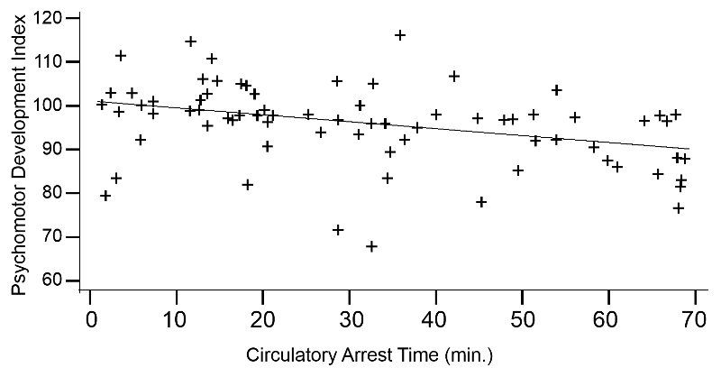
Adapted from Bellinger et.al., N Engl J Med. 1995 Mar 2;332(9):549-55.
The simple linear regression equation for these observations was as follows:
Psychomotor Development Index = 101.25 – 0.164 (circ. arrest time)
with R2=0.138, p=0.002
The developmental index that was used had a mean of 100 in normal one year old children. The Y-intercept from the regression is 101.25, so in this case the Y-intercept makes sense. Be aware, however, that the Y-intercept is frequently not interpretable; it only makes sense when it corresponds to a logical "basal" value.
The slope from the regression line is -0.164, suggesting that for each minute the infant is on the bypass pump, there is an associated decrease of 0.164 units in the psychomotor development score one year later. So, the regression line begins at 101.25 at 0 minutes and declines to a score of about 90 after 70 minutes on the bypass pump.
The individual data points are scattered about the regression line, but the association is statistically significant, with p=0.002. The R2=0.138, suggesting that about 13.8% of the variability in psychomotor development score can be attributed to differences in time on the bypass pump.
Test Yourself
Data from the Framingham Heart Study was used to test the association between age (AGE) and systolic blood pressure (SYSBP). The following analysis was conducted:
> reg.out<-lm(SYSBP~AGE)
> summary(reg.out)
Call:
lm(formula = SYSBP ~ AGE)
Residuals:
Min 1Q Median 3Q Max
-57.52 -13.82 -2.35 10.02 148.30
Coefficients:
Estimate Std. Error t value Pr(>|t|)
(Intercept) 86.1165 5.6213 15.32 <2e-16 ***
AGE 0.9466 0.1112 8.51 <2e-16 ***
---
Signif. codes: 0 '***' 0.001 '**' 0.01 '*' 0.05 '.' 0.1 ' ' 1
Residual standard error: 21.02 on 498 degrees of freedom
Multiple R-squared: 0.127, Adjusted R-squared: 0.1252
F-statistic: 72.43 on 1 and 498 DF, p-value: < 2.2e-16
Answers
Now, let's get back to the study on the effects of TV viewing that was presented at the beginning of this module. Hancox et al. assessed the mean number of hours of TV viewing per weekday in a random sample of 1,000 children at two-year intervals from the ages of 5 to 15 and then again at 21 years of age.
Correlations
In their analysis they first calculated the correlation coefficient for mean hours watched at age 5 with hours watched at older ages. The table below summarizes these finding and shows that the strength of the correlations declined over time, although all of these were statistically significant at p<0.02 or better.
| Age | Correlation to Hours at Age 5 (r) |
|---|---|
| 7 | 0.35 |
| 9 | 0.33 |
| 11 | 0.21 |
| 13 | 0.19 |
| 15 | 0.16 |
| 21 | 0.08 |
They looked at a number of other correlations as well, for example:
Socioeconomic status (SES) of the parents: SES was measured based on the highest parental occupation on a six-point scale, based on the educational level and income associated with a given occupation. A score of 6 indicated an unskilled laborer, and a score of 1 indicated a professional). TV viewing was positively correlated with SES (r=0.31, p<0.0001), indicating that children watching more TV were more likely to have parents with lower SES.
Physical activity at age 15: Hours of TV watching was negatively correlated with physical activity at age 15 (r= 0.09, p=0.01), suggesting that more TV viewing was associated with less physical activity. Note that this correlation was very weak, but it was statistically significant, because it was based on a sample of n=1,000.
Regression Analysis
The authors also conducted regression analyses to determine whether average hours of daily TV viewing from ages 5 to 15 predicted health status as young adults. The table below summarizes these analyses. Note that the left side of the table summarizes findings that were unadjusted for confounding, i.e.,. the result of the simple linear regression with hours of TV watching as the only independent (predictor) variable. The right side of the table summarizes results after using multiple variable regression analysis to adjust for confounding by sex, SES, BMI at age 5, parental BMI, and physical activity at age 15. We will discuss confounding and the use of multiple variable regression analysis to adjust for confounding in a later module.
Table – Summary of Regression Analyses for Childhood TV Viewing as a Predictor of BMI and Blood Pressure as Adults
| Outcome | Unadjusted Analysis | Adjusted Analysis | ||||||
| b | SE | p | b | SE | p | |||
| BMI | 0.54 | 0.17 | 0.001 | 0.48 | 0.19 | 0.01 | ||
| Systolic blood pressure | 0.64 | 0.38 | 0.09 | 0.46 | 0.40 | 0.24 | ||
Test Yourself
What is Your Hat Size? A Series of Questions on Brain Size & Intelligence
Do people with larger brains have greater intelligence? To investigate the association between brain size and IQ, a sample of 38 undergraduates underwent MRI imaging to determine brain size and also completed the Wechsler Adult Intelligence Scale, which gives measures of Full Scale (overall) IQ [, Verbal IQ, and Performance (non-verbal) IQ. Brain size was measured by the number of pixels from the brain image based on 18 MRI scans, where higher pixel count indicates larger brain volume. The data is recorded in the file "Brain Size and IQ.csv", which is located with the data files for this course.
The data is coded as follows:
| Variable name | Coded as: |
| Female | Male=0; female=1 |
| FSIQ | Wechsler Full Scale IQ score |
| VIQ | Wechsler Verbal IQ score |
| PIQ | Wechsler Performance IQ score |
| Weight | Weight (pounds) |
| Height | Height (inches) |
| MRI_Count | Pixel count from MRI scans |
Question 1. Do taller people have bigger brains? – Find the correlation coefficient and the p-value for the correlation between Height and brain size (MRI_Count). Give an interpretation of this correlation coefficient, and report on the statistical significance.
Question 2. Do taller people have higher IQ? – Find the correlation coefficient and the p-value for the correlation between Height and Full Scale IQ. Give an interpretation of this correlation coefficient, and report on the statistical significance.
Question 3. Our primary interest is in the association between brain size and Full Scale IQ. Create a scatter plot showing the association between Full Scale IQ (the dependent variable, plotted on the Y axis) and brain size (the independent variable, plotted on the X axis). Perform a regression predicting Full Scale IQ from brain size (MRI_count):
Question 3a. Report and interpret the R2 from this regression.
Question 3b. Based on the regression for FSIQ. Is there a significant association between brain size and FSIQ?
Question 3c. Report the regression equation for FSIQ and brain size. Calculate the predicted IQ for a subject with MRI_count of 8.0 (a relatively small brain in this sample)
Question 3d. Calculate the predicted IQ for a subject with MRI_count of 10.0 (a relatively large brain in this sample).
Link to Answers in a Word file