


Exercise 2 - Graphing
In the handouts on the right side of the page there is a link to a spreadsheet called "MAVEN data set." This contains de-identified data from MAVEN (the Massachusetts Virtual Epidemiologic Network), which is used for surveillance of infectious diseases.
The lower portion of the first worksheet lists partial data for over 1,500 cases of infectious disease reported to MAVEN. (For simplicity, the data set you see contains some of the more common infectious diseases). Note that I have already sorted the data by type of infection.
In the uppermost portion of the spreadsheet I have created a summary table that uses the "COUNT" function to count the number of cases of each type of infection.
- The last entry in the summary table for Shigella was left incomplete on purpose. Scroll down to the bottom of the data set to see which rows are occupied by Shigella cases; then scroll back up to the summary table and use the COUNT function to compute the number of Shigella cases. Note that you will have to "count" the occurrences using the date column, since the function only works for numeric entries.
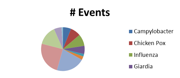
- Now select cells B1 through C12 and click on the graphing icon (the color pie chart) on your customizable toolbar. If hasn't been added yet, you can add it now or click on "Insert" on the top level menu to see the Chart options. Select the option for a pie chart. This should result in immediate construction of a pie chart for the summary data.
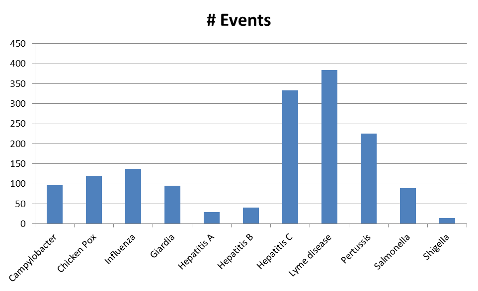
- Now repeat the process, but select a column chart instead of a pie chart.
- Delete the legend on the column chart. Clicking on the legend on the right side of the chart, and delete it.
- Now resize the pie chart and the column chart by moving your mouse over the edges and clicking to grab an edge or a corner and moving your mouse to resize the chart.
Your charts should look something like the ones below:
Creating an Epidemic Curve
In the handouts on the right side of this page, the Excel file called "Epi_Tools.XLS" has two worksheets, each demonstrating a simple way to create an epidemic curve when you have dates of onset for a series of cases. The first method, simply sorting the cases by date of onset and then counting the number of cases occurring at, say, two day intervals, is illustrated in the worksheet called "Epi Curve 1". The second method, using pivot tables, is illustrated in the worksheet called "Epi Curve 2".