Summarizing Data
Descriptive Statistics
The first step in solving problems in public health and making evidence-based decisions is to collect accurate data and to describe, summarize, and present it in such a way that it can be used to address problems. Information consists of data elements or data points which represent the variables of interest. When dealing with public health problems the units of measurement are most often individual people, although if we were studying differences in medical practice across the US, the subjects, or units of measurement, might be hospitals. A population consists of all subjects of interest, in contrast to a sample, which is a subset of the population of interest. It is generally not possible to gather information on all members of a population of interest. Instead, we select a sample from the population of interest, and generalizations about the population are based on the assumption that the sample is representative of the population from which it was drawn.
After completing this module, the student will be able to:

Procedures to summarize data and to perform subsequent analysis differ depending on the type of data (or variables) that are available. As a result, it is important to have a clear understanding of how variables are classified.
There are three general classifications of variables:
1) Discrete Variables: variables that assume only a finite number of values, for example, race categorized as non-Hispanic white, Hispanic, black, Asian, other. Discrete variables may be further subdivided into:
2) Continuous Variables: These are sometimes called quantitative or measurement variables; they can take on any value within a range of plausible values. For example, total serum cholesterol level, height, weight and systolic blood pressure are examples of continuous variables.
3) Time to Event Variables: these reflect the time to a particular event such as a heart attack, cancer remission or death.
Frequency distribution tables are a common and useful way of summarizing discrete variables. Representative examples are shown below.
In the offspring cohort of the Framingham Heart Study 3,539 subjects completed the 7th examination between 1998 and 2001, which included an extensive physical examination. One of the variables recorded was sex as summarized below in a frequency distribution table.
Table 1 - Frequency Distribution Table for Sex
|
Sex |
Frequency |
Relative Frequency, % |
|---|---|---|
|
Male |
1,625 |
45.9 |
|
Female |
1,914 |
54.1 |
|
Total |
3,539 |
100.0 |
Note that the third column contains the relative frequencies, which are computed by dividing the frequency in each response category by the sample size (e.g., 1,625/3,539 = 0.459). With dichotomous variables the relative frequencies are often expressed as percentages (by multiplying by 100).
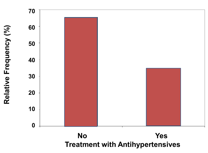
The investigators also recorded whether or not the subjects were being treated with antihypertensive medication, as shown below.
Table 2 - Frequency Distribution Table for Treatment with Antihypertensive Medication
|
Treatment |
Frequency |
Relative Frequency (%) |
|---|---|---|
|
No |
2,313 |
65.5 |
|
Yes |
1,219 |
34.5 |
|
Total |
3,532 |
100.0 |
Note in the table above that there are only n=3,532 valid responses, although the sample size was n=3,539. This indicates that seven individuals had missing data on this particular question. Missing data occurs in studies for a variety of reasons. If there is extensive missing data or if there is a systematic pattern of missing responses, the results of the analysis may be biased (see the module on Bias for EP713 for more detail.) There are techniques for handling missing data, but these are beyond the scope of this course
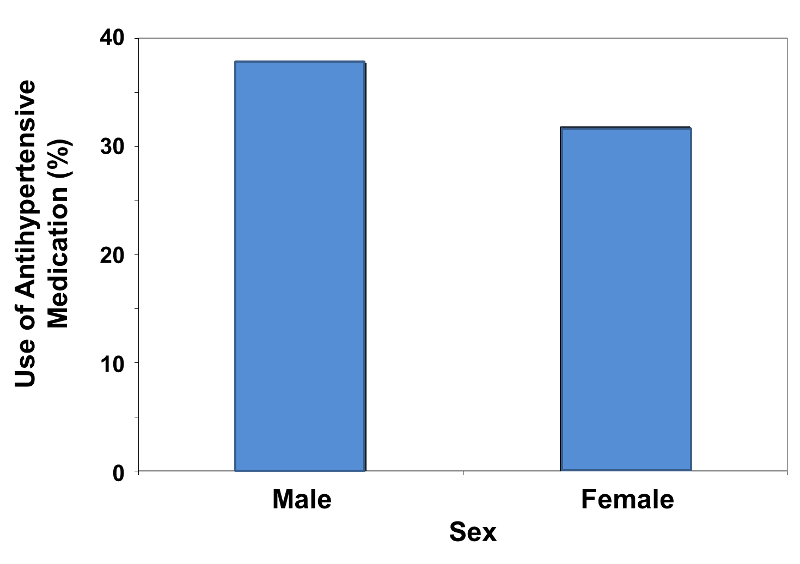
Sometimes it is of interest to compare two or more groups on the basis of a dichotomous outcome variable. For example, suppose we wish to compare the extent of treatment with antihypertensive medication in men and women, as summarized in the table below.
Table 3 - Treatment with Antihypertensive Medication in Men and Women
|
Sex |
Number on Treatment / n |
Relative Frequency, % |
|---|---|---|
|
Male |
611/1,622 |
37.7 |
|
Female |
608/1,910 |
31.8 |
|
Total |
1,219/3,532 |
34.5 |
Here, both sex and treatment status are dichotomous variables. Because the numbers of men and women are unequal, the relative frequency of treatment for each sex must be calculated by dividing the number on treatment by the sample size for the sex. The numbers of men and women being treated (frequencies) are almost identical, but the relative frequencies indicate that a higher percentage of men are being treated than women. Note also that the sum of the rightmost column is not 100.0% as it was in previous examples, because it indicates the relative frequency of treatment among all participants (men and women) combined.
Recall that categorical variables are those with two or more distinct responses that are unordered. Some examples of categorical variables measured in the Framingham Heart Study include marital status, handedness (right or left) and smoking status. Because the responses are unordered, the order of the responses or categories in the summary table can be changed, for example, presenting the categories alphabetically or perhaps from the most frequent to the least frequent.
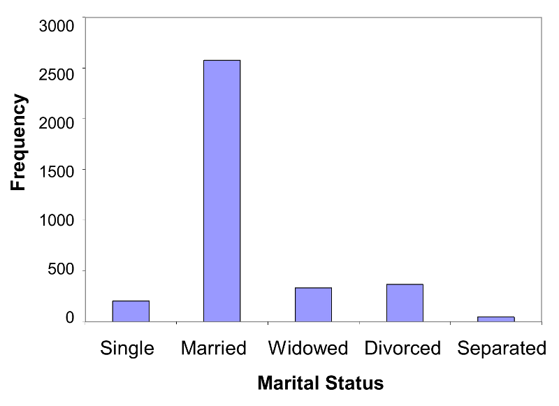
Table 4 below summarizes data on marital status from the Framingham Heart Study. The mutually exclusive and exhaustive categories are shown in the first column of the table. The frequencies, or numbers of participants in each response category, are shown in the middle column and the relative frequencies, as percentages, are shown in the rightmost column.
Table 4 - Frequency Distribution Table for Marital Status
|
Marital Status |
Frequency |
Relative Frequency, % |
|---|---|---|
|
Single |
203 |
5.8 |
|
Married |
2,580 |
73.1 |
|
Widowed |
334 |
9.5 |
|
Divorced |
367 |
10.4 |
|
Separated |
46 |
1.3 |
|
Total |
3,530 |
100.0 |
There are n=3,530 valid responses to the marital status question (9 participants did not provide marital status data). The majority of the sample is married (73.1%), and approximately 10% of the sample is divorced. Another 10% are widowed, 6% are single, and 1% are separated.
Some discrete variables are inherently ordinal. In addition to inherently ordered categories (e.g., excellent, very good, good, fair, poor), investigators will sometimes collect information on continuously distributed measures, but then categorize these measurements because it makes it easier for clinical decision making. For example, the NHLBI (National Heart Lung, and Blood Institute and the American Heart Association use the following classification of blood pressure:
The American Heart Association uses the following classification for total cholesterol levels:
Body mass index (BMI) is computed as the ratio of weight in kilograms to height in meters squared and the following categories are often used:
These are all examples of common continuous measures that have been categorized to create ordinal variables. The table below is a frequency distribution table for the ordinal blood pressure variable. The mutually exclusive and exhaustive categories are shown in the first column of the table. The frequencies, or numbers of participants in each response category, are shown in the middle column and the relative frequencies, as percentages, are shown in the rightmost columns. The key summary statistics for ordinal variables are relative frequencies and cumulative relative frequencies.
Table 5 - Frequency Distribution for Blood Pressure Category
|
Blood Pressure |
Frequency |
Relative Frequency (%) |
Cumulative Frequency |
Cumulative Relative Frequency, % |
|---|---|---|---|---|
|
Normal |
1,206 |
34.1 |
1,206 |
34.1 |
|
Pre-Hypertension |
1,452 |
41.1 |
2,658 |
75.2 |
|
Stage I Hypertension |
653 |
18.5 |
3,311 |
93.7 |
|
Stage II Hypertension |
222 |
6.3 |
3,533 |
100.0 |
|
Total |
3,533 |
100.0 |
|
|
Note that the cumulative frequencies reflect the number of patients at the particular blood pressure level or below. For example, 2,658 patients have normal blood pressure or pre-hypertension. There are 3,311 patients with normal, pre-hypertension or Stage I hypertension. The cumulative relative frequencies are very useful for summarizing ordinal variables and indicate the proportion (between 0-1) or percentage (between 0%-100%) of patients at a particular level or below. In this example, 75.2% of the patients are NOT classified as hypertensive (i.e., they have normal blood pressure or pre-hypertension). Notice that for the last (highest) blood pressure category, the cumulative frequency is equal to the sample size (n=3,533) and the cumulative relative frequency is 100% indicating that all of the patients are at the highest level or below.


Table 6 - Frequency Distribution Table for Smoking Status
|
Smoking Status |
Frequency |
Relative Frequency, % |
|---|---|---|
|
Non-Smoker |
1,330 |
37.6 |
|
Former |
1,724 |
48.8 |
|
Current |
482 |
13.6 |
|
Total |
3,536 |
100.0 |
Graphical displays are very useful for summarizing data, and both dichotomous and non-ordered categorical variables are best summarized with bar charts. The response options (e.g., yes/no, present/absent) are shown on the horizontal axis and either the frequencies or relative frequencies are plotted on the vertical axis. Figure 1 below is a frequency bar chart which corresponds to the tabular presentation in Table 1 above.
Figure 1 - Frequency Bar Chart
Note that for dichotomous and categorical variables there should be a space in between the response options. The analogous graphical representation for an ordinal variable does not have spaces between the bars in order to emphasize that there is an inherent order.
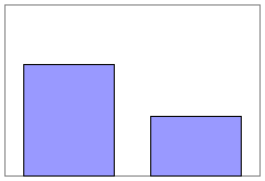
In contrast, figure 2 below illustrates a relative frequency bar chart of the distribution of treatment with antihypertensive medications. This graphical representation corresponds to the tabular presentation in the last column of Table 2 above.
Figure 2 - Relative Frequency Bar Chart
A frequency bar chart for marital status might look like Figure 3 below.
Figure 3
Consider the graphical representation of the data in Table 3 above, comparing the relative frequency of antihypertensive medications between men and women. It would appropriately look like the figure shown below. Note that a range of 0 - 40 was chosen for the vertical axis.
Figure 4
![]() Pitfall:
Pitfall:
For the example above the relative frequencies are 31.8% and 37.7%, so scaling the vertical axis from 0 to 40% is appropriate to accommodate the data. However, one can visually mislead the reader regarding the comparison by using a vertical scale that is either too expansive or too restrictive. Consider the two bar charts below (Figures 5 & 6).
Figure 5
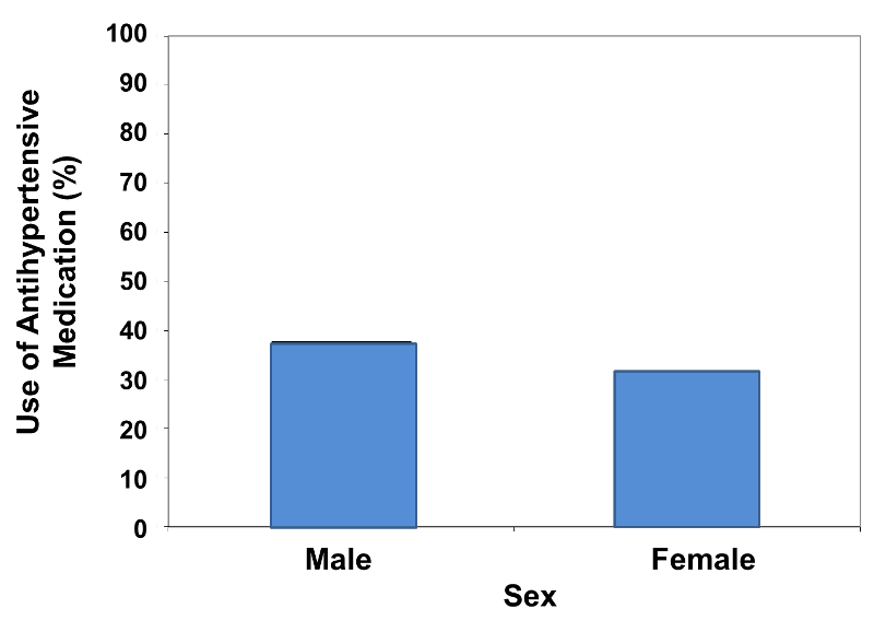
Figure 6
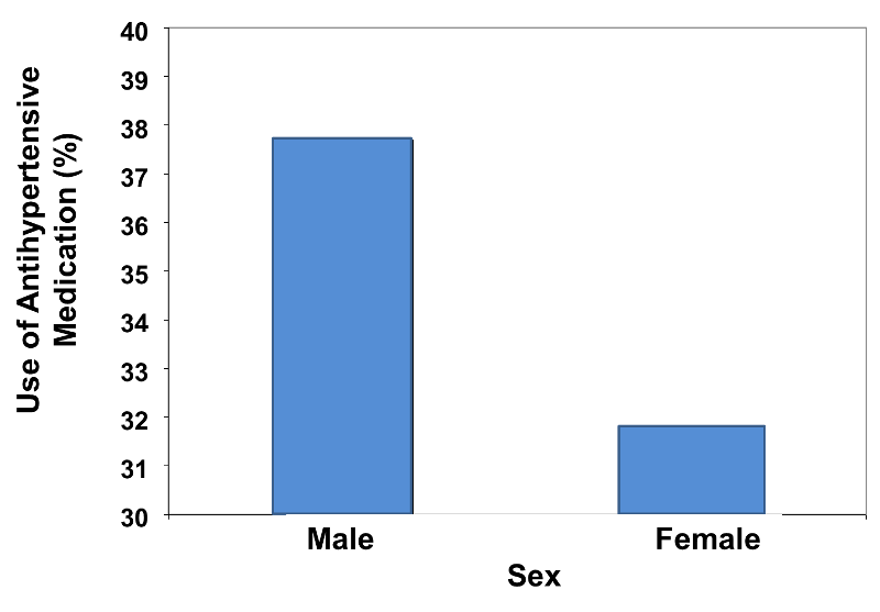
These bar charts display the same relative frequencies, i.e., 31.8% and 37.7%. However, the bar chart on the left minimizes the difference, because the vertical scale is too expansive, ranging from 0 - 100%. On the other hand, the bar chart on the right visually exaggerates the difference, because the vertical scale is too restrictive, ranging from 30 - 40%.
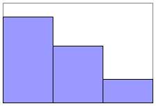
A distinguishing feature of bar charts for dichotomous and non-ordered categorical variables is that the bars are separated by spaces to emphasize that they describe non-ordered categories. When one is dealing with ordinal variables, however, the appropriate graphical format is a histogram. A histogram is similar to a bar chart, except that the adjacent bars abut one another in order to reinforce the idea that the categories have an inherent order. The frequency histogram below summarizes the blood pressure data that was presented in a tabular format in Table 4 on the previous page. Note that the vertical axis displays the frequencies or numbers of participants classified in each category.
Figure 7 Frequency Histogram for Blood Pressure
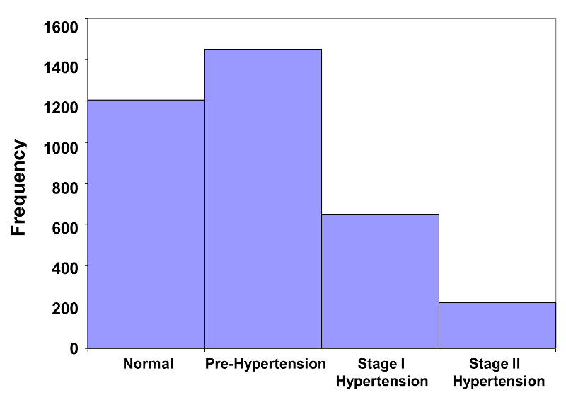
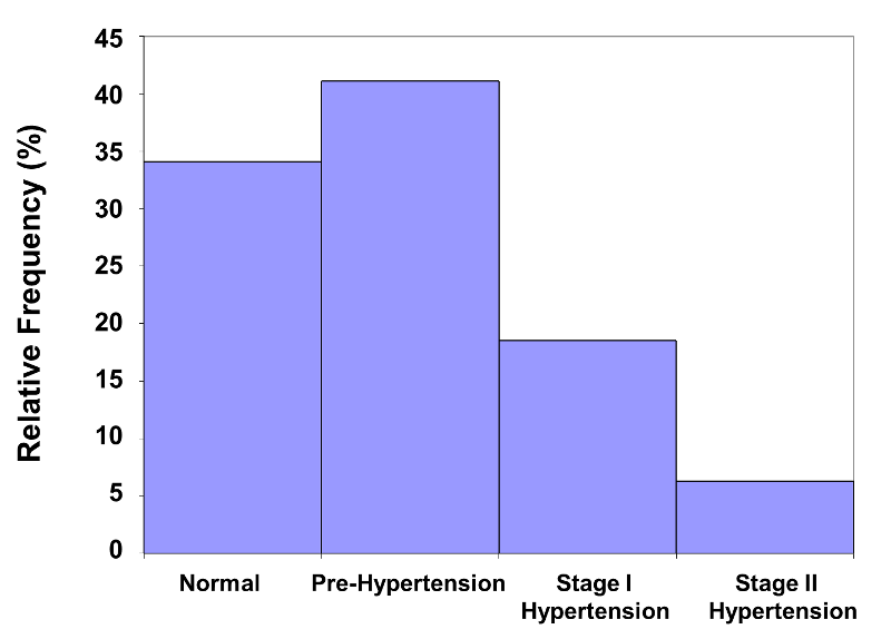
This histogram immediately conveys the message that the majority of participants are in the lower two categories of the distribution. A small number of participants are in the Stage II hypertension category. The histogram below is a relative frequency histogram for the same data. Note that the figure is the same, except for the vertical axis, which is scaled to accommodate relative frequencies instead of frequencies.
Figure 8 - Relative Frequency Histogram for Blood Pressure
In order to provide a detailed description of the computations used for numerical and graphical summaries of continuous variables, we selected a small subset (n=10) of participants in the Framingham Heart Study. The data values for these ten participants are shown in the table below. The rightmost column contains the body mass index (BMI) computed using the height and weight measurements.
Table 8 - Data Values for a Small Sample
|
Participant ID |
Systolic Blood Pressure |
Diastolic Blood Pressure |
Total Serum Cholesterol |
Weight |
Height |
Body Mass Index |
|---|---|---|---|---|---|---|
|
1 |
141 |
76 |
199 |
138 |
63.00 |
24.4 |
|
2 |
119 |
64 |
150 |
183 |
69.75 |
26.4 |
|
3 |
122 |
62 |
227 |
153 |
65.75 |
24.9 |
|
4 |
127 |
81 |
227 |
178 |
70.00 |
25.5 |
|
5 |
125 |
70 |
163 |
161 |
70.50 |
22.8 |
|
6 |
123 |
72 |
210 |
206 |
70.00 |
29.6 |
|
7 |
105 |
81 |
205 |
235 |
72.00 |
31.9 |
|
8 |
113 |
63 |
275 |
151 |
60.75 |
28.8 |
|
9 |
106 |
67 |
208 |
213 |
69.00 |
31.5 |
|
10 |
131 |
77 |
159 |
142 |
61.00 |
26.8 |
The first summary statistic that is important to report for a continuous variable (as well as for any discrete variable) is the sample size (in the example here, sample size is n=10). Larger sample sizes produce more precise results and therefore carry more weight. However, there is a point at which increasing the sample size will not materially increase the precision of the analysis. Sample size computations will be discussed in detail in a later module.
Because this sample is small (n=10), it is easy to summarize the sample by inspecting the observed values, for example, by listing the diastolic blood pressures in ascending order:
62 63 64 67 70 72 76 77 81 81
Diastolic blood pressures <80 mm Hg are considered normal, and we can see that the last two exceed the upper limit just barely. However, for a large sample, inspection of the individual data values does not provide a meaningful summary, and summary statistics are necessary. The two key components of a useful summary for a continuous variable are:
In biostatistics, the term 'average' is a very general term that can be addressed by several statistics. The one that is most familiar is the sample mean, which is computed by summing all of the values and dividing by the sample size. For the sample of diastolic blood pressures in the table above, the sample mean is computed as follows:
Sample mean = (62+63+64+67+70+72+76+77+81+81) /10 = 71.3
To simplify the formulas for sample statistics (and for population parameters), we usually denote the variable of interest as "X". X is simply a placeholder for the variable being analyzed. Here X=diastolic blood pressure.
The general formula for the sample mean is:

The X with the bar over it represents the sample mean, and it is read as "X bar". The Σ indicates summation (i.e., sum of the X's or sum of the diastolic blood pressures in this example).
When reporting summary statistics for a continuous variable, the convention is to report one more decimal place than the number of decimal places measured. Systolic and diastolic blood pressures, total serum cholesterol and weight were measured to the nearest integer, therefore the summary statistics are reported to the nearest tenth place. Height was measured to the nearest quarter inch (hundredths place), therefore the summary statistics are reported to the nearest thousandths place. Body mass index was computed to the nearest tenths place, summary statistics are reported to the nearest hundredths place.
A second measure of the "average" value is the sample median, which is the middle value in the ordered data set, or the value that separates the top 50% of the values from the bottom 50%. When there is an odd number of observations in the sample, the median is the value that holds as many values above it as below it in the ordered data set. When there is an even number of observations in the sample (e.g., n=10) the median is defined as the mean of the two middle values in the ordered data set. In the sample of n=10 diastolic blood pressures, the two middle values are 70 and 72, and thus the median is (70+72)/2 = 71. Half of the diastolic blood pressures are above 71 and half are below. In this case, the sample mean and the sample median are very similar.
The mean and median provide different information about the average value of a continuous variable. Suppose the sample of 10 diastolic blood pressures looked like the following:
62 63 64 67 70 72 76 77 81 140
In this case, the sample mean (x 'bar') = 772/10 = 77.2, but this does not strike us as a "typical" value, since the majority of diastolic blood pressures in this sample are below 77.2. The extreme value of 140 is affecting the computation of the mean. For this same sample, the median is 71. The median is unaffected by extreme or outlying values. For this reason, the median is preferred over the mean when there are extreme values (either very small or very large values relative to the others). When there are no extreme values, the mean is the preferred measure of a typical value, in part because each observation is considered in the computation of the mean. When there are no extreme values in a sample, the mean and median of the sample will be close in value. Below we provide a more formal method to determine when values are extreme and thus when the median should be used.
Table 9 displays the sample means and medians for each of the continuous measures for the sample of n=10 in Table 8.
Table 9 - Means and Medians of Variables in Subsample of Size n=10
|
Variable |
Mean |
Median |
|---|---|---|
|
Diastolic Blood Pressure |
71.3 |
71 |
|
Systolic Blood Pressure |
121.2 |
122.5 |
|
Total Serum Cholesterol |
202.3 |
206.5 |
|
Weight |
176.0 |
169.5 |
|
Height |
67.175 |
69.375 |
|
Body Mass Index |
27.26 |
26.60 |
For each continuous variable measured in the subsample of n=10 participants, the means and medians are not identical but are relatively close in value suggesting that the mean is the most appropriate summary of a typical value for each of these variables. (If the mean and median are very different, it suggests that there are outliers affecting the mean.)
A third measure of a "typical" value for a continuous variable is the mode, which is defined as the most frequent value. In Table 8 above the mode of the diastolic blood pressures is 81, the mode of the total cholesterol levels is 227, the mode of the heights is 70.00, because these values each appear twice when the other values only appear only once. For each of the other continuous variables, there are 10 distinct values and thus there is no mode, since no value appears more frequently than any other.
Suppose the diastolic blood pressures had been:
62 63 64 64 70 72 76 77 81 81
In this sample there are two modes: 64 and 81. The mode is a useful summary statistic for a continuous variable. It is not presented instead of either the mean or the median, but rather in addition to the mean or median.
The second aspect of a continuous variable that must be summarized is the variability in the sample. A relatively crude, yet important, measure of variability in a sample is the sample range. The sample range is computed as follows:
Sample Range = Maximum – Minimum Value
Table 10 displays the sample ranges for each of the continuous measures in the subsample of n=10 observations.
Table 10 Ranges of Variables in Subsample of Size n=10
|
Variable |
Minimum |
Maximum |
Range |
|---|---|---|---|
|
Diastolic Blood Pressure |
62 |
81 |
19 |
|
Systolic Blood Pressure |
105 |
141 |
36 |
|
Total Serum Cholesterol |
150 |
275 |
125 |
|
Weight |
138 |
235 |
97 |
|
Height |
60.75 |
72.00 |
11.25 |
|
Body Mass Index |
22.8 |
31.9 |
9.1 |
The range of a variable depends on the scale of measurement. The blood pressures are measured in millimeters of mercury; total cholesterol is measured in milligrams per deciliter, weight in pounds, and so on. The range of total serum cholesterol is large with the minimum and maximum in the sample of size n=10 differing by 125 units. In contrast, the heights of participants are more homogeneous with a range of 11.25 inches. The range is an important descriptive statistic for a continuous variable, but it is based only on two values in the data set. Like the mean, the sample range can be affected by extreme values and thus it must be interpreted with caution. The most widely used measure of variability for a continuous variable is called the standard deviation, which is illustrated below.
If there are no extreme or outlying values of a variable, the mean is the most appropriate summary of a typical value, and to summarize variability in the data we specifically estimate the variability in the sample around the sample mean. If all of the observed values in a sample are close to the sample mean, the standard deviation will be small (i.e., close to zero), and if the observed values vary widely around the sample mean, the standard deviation will be large. If all of the values in the sample are identical, the sample standard deviation will be zero.
When discussing the sample mean, we found that the sample mean for diastolic blood pressure was 71.3. The table below shows each of the observed values along with its respective deviation from the sample mean.

Table 11 - Diastolic Blood Pressures and Deviation from the Sample Mean
|
X=Diastolic Blood Pressure |
Deviation from the Mean |
|---|---|
|
76 |
4.7 |
|
64 |
-7.3 |
|
62 |
-9.3 |
|
81 |
9.7 |
|
70 |
-1.3 |
|
72 |
0.7 |
|
81 |
9.7 |
|
63 |
-8.3 |
|
67 |
-4.3 |
|
77 |
5.7 |
|
|
|
The deviations from the mean reflect how far each individual's diastolic blood pressure is from the mean diastolic blood pressure. The first participant's diastolic blood pressure is 4.7 units above the mean while the second participant's diastolic blood pressure is 7.3 units below the mean. What we need is a summary of these deviations from the mean, in particular a measure of how far, on average, each participant is from the mean diastolic blood pressure. If we compute the mean of the deviations by summing the deviations and dividing by the sample size we run into a problem. The sum of the deviations from the mean is zero. This will always be the case as it is a property of the sample mean, i.e., the sum of the deviations below the mean will always equal the sum of the deviations above the mean. However, the goal is to capture the magnitude of these deviations in a summary measure. To address this problem of the deviations summing to zero, we could take absolute values or square each deviation from the mean. Both methods would address the problem. The more popular method to summarize the deviations from the mean involves squaring the deviations (absolute values are difficult in mathematical proofs). Table 12 below displays each of the observed values, the respective deviations from the sample mean and the squared deviations from the mean.
Table 12
|
X=Diastolic Blood Pressure |
Deviation from the Mean
|
Squared Deviation from the Mean
|
|
76 |
4.7 |
22.09 |
|
64 |
-7.3 |
53.29 |
|
62 |
-9.3 |
86.49 |
|
81 |
9.7 |
94.09 |
|
70 |
-1.3 |
1.69 |
|
72 |
0.7 |
0.49 |
|
81 |
9.7 |
94.09 |
|
63 |
-8.3 |
68.89 |
|
67 |
-4.3 |
18.49 |
|
77 |
5.7 |
32.49 |
|
|
|
|
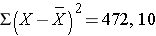
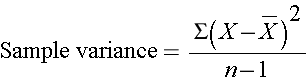
The squared deviations are interpreted as follows. The first participant's squared deviation is 22.09 meaning that his/her diastolic blood pressure is 22.09 units squared from the mean diastolic blood pressure, and the second participant's diastolic blood pressure is 53.29 units squared from the mean diastolic blood pressure. A quantity that is often used to measure variability in a sample is called the sample variance, and it is essentially the mean of the squared deviations. The sample variance is denoted s2 and is computed as follows:
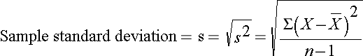
In this sample of n=10 diastolic blood pressures, the sample variance is s2 = 472.10/9 = 52.46. Thus, on average diastolic blood pressures are 52.46 units squared from the mean diastolic blood pressure. Because of the squaring, the variance is not particularly interpretable. The more common measure of variability in a sample is the sample standard deviation, defined as the square root of the sample variance:
When a data set has outliers or extreme values, we summarize a typical value using the median as opposed to the mean. When a data set has outliers, variability is often summarized by a statistic called the interquartile range, which is the difference between the first and third quartiles. The first quartile, denoted Q1, is the value in the data set that holds 25% of the values below it. The third quartile, denoted Q3, is the value in the data set that holds 25% of the values above it. The quartiles can be determined following the same approach that we used to determine the median, but we now consider each half of the data set separately. The interquartile range is defined as follows:
Interquartile Range = Q3-Q1
With an Even Sample Size:
For the sample (n=10) the median diastolic blood pressure is 71 (50% of the values are above 71, and 50% are below). The quartiles can be determined in the same way we determined the median, except we consider each half of the data set separately.
Figure 9 - Interquartile Range with Even Sample Size
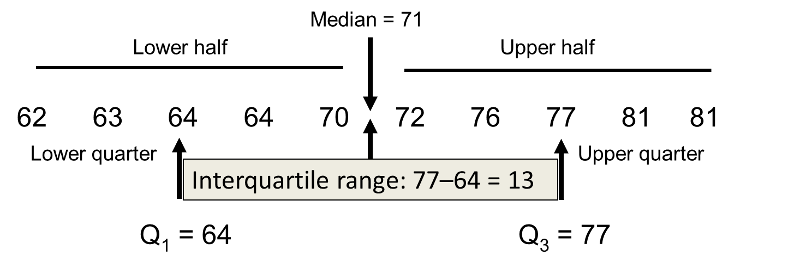
There are 5 values below the median (lower half), the middle value is 64 which is the first quartile. There are 5 values above the median (upper half), the middle value is 77 which is the third quartile. The interquartile range is 77 – 64 = 13; the interquartile range is the range of the middle 50% of the data.
----------------------------------------------------------------------------------------------------------------------------------------------------------------
With an Odd Sample Size:
When the sample size is odd, the median and quartiles are determined in the same way. Suppose in the previous example, the lowest value (62) were excluded, and the sample size was n=9. The median and quartiles are indicated below.
Figure 10 - Interquartile Range with Odd Sample Size
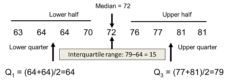
When the sample size is 9, the median is the middle number 72. The quartiles are determined in the same way looking at the lower and upper halves, respectively. There are 4 values in the lower half, the first quartile is the mean of the 2 middle values in the lower half ((64+64)/2=64). The same approach is used in the upper half to determine the third quartile ((77+81)/2=79).
When there are no outliers in a sample, the mean and standard deviation are used to summarize a typical value and the variability in the sample, respectively. When there are outliers in a sample, the median and interquartile range are used to summarize a typical value and the variability in the sample, respectively.
|
Tukey Fences There are several methods for determining outliers in a sample. A very popular method is based on the following:
Outliers are values below Q1-1.5(Q3-Q1) or above Q3+1.5(Q3-Q1) or equivalently, values below Q1-1.5 IQR or above Q3+1.5 IQR. These are referred to as Tukey fences.6 For the diastolic blood pressures, the lower limit is 64 - 1.5(77-64) = 44.5 and the upper limit is 77 + 1.5(77-64) = 96.5. The diastolic blood pressures range from 62 to 81. Therefore there are no outliers. The best summary of a typical diastolic blood pressure is the mean (in this case 71.3) and the best summary of variability is given by the standard deviation (s=7.2). |
Table 13 displays the means, standard deviations, medians, quartiles and interquartile ranges for each of the continuous variables in the subsample of n=10 participants who attended the seventh examination of the Framingham Offspring Study.
Table 13 - Summary Statistics on n=10 Participants
|
Characteristic |
Mean |
Standard Deviation |
Median |
Q1 |
Q3 |
IQR |
|---|---|---|---|---|---|---|
|
Systolic Blood Pressure |
121.2 |
11.1 |
122.5 |
113.0 |
127.0 |
14.0 |
|
Diastolic Blood Pressure |
71.3 |
7.2 |
71.0 |
64.0 |
77.0 |
13.0 |
|
Total Serum Cholesterol |
202.3 |
37.7 |
206.5 |
163.0 |
227.0 |
64.0 |
|
Weight |
176.0 |
33.0 |
169.5 |
151.0 |
206.0 |
55.0 |
|
Height |
67.175 |
4.205 |
69.375 |
63.0 |
70.0 |
7.0 |
|
Body Mass Index |
27.26 |
3.10 |
26.60 |
24.9 |
29.6 |
4.7 |
Table 14 displays the observed minimum and maximum values along with the limits to determine outliers using the quartile rule for each of the variables in the subsample of n=10 participants. Are there outliers in any of the variables? Which statistics are most appropriate to summarize the average or typical value and the dispersion?
Table 14 - Limits for Assessing Outliers in Characteristics Measured in the n=10 Participants
|
Characteristic |
Minimum |
Maximum |
Lower Limit1 |
Upper Limit2 |
|---|---|---|---|---|
|
Systolic Blood Pressure |
105 |
141 |
92 |
148 |
|
Diastolic Blood Pressure |
62 |
81 |
44.5 |
96.5 |
|
Total Serum Cholesterol |
150 |
275 |
67 |
323 |
|
Weight |
138 |
235 |
68.5 |
288.5 |
|
Height |
60.75 |
72.00 |
52.5 |
80.5 |
|
Body Mass Index |
22.8 |
31.9 |
17.85 |
36.65 |
1 Determined byQ1-1.5(Q3-Q1)
2 Determined by Q3+1.5(Q3-Q1)
Since there are no suspected outliers in the subsample of n=10 participants, the mean and standard deviation are the most appropriate statistics to summarize average values and dispersion, respectively, of each of these characteristics.
The Full Framingham Cohort
For clarity, we have so far used a very small subset of the Framingham Offspring Cohort to illustrate calculations of summary statistics and determination of outliers. For your interest, Table 15 displays the means, standard deviations, medians, quartiles and interquartile ranges for each of the continuous variable displayed in Table 13 in the full sample (n=3,539) of participants who attended the seventh examination of the Framingham Offspring Study.
Table 15 - Summary Statistics on Sample of (n=3,539) Participants
|
Characteristic |
Mean
|
Standard Deviation (s) |
Median |
Q1 |
Q3 |
IQR |
|
Systolic Blood Pressure |
127.3 |
19.0 |
125.0 |
114.0 |
138.0 |
24.0 |
|
Diastolic Blood Pressure |
74.0 |
9.9 |
74.0 |
67.0 |
80.0 |
13.0 |
|
Total Serum Cholesterol |
200.3 |
36.8 |
198.0 |
175.0 |
223.0 |
48.0 |
|
Weight |
174.4 |
38.7 |
170.0 |
146.0 |
198.0 |
52.0 |
|
Height |
65.957 |
3.749 |
65.750 |
63.000 |
68.750 |
5.75 |
|
Body Mass Index |
28.15 |
5.32 |
27.40 |
24.5 |
30.8 |
6.3 |
Table 16 displays the observed minimum and maximum values along with the limits to determine outliers using the quartile rule for each of the variables in the full sample (n=3,539).
Table 16 - Limits for Assessing Outliers in Characteristics Presented in Table 15
|
|
|
|
Tukey Fences |
|
|
Characteristic |
Minimum |
Maximum |
Lower Limit1 |
Upper Limit2 |
|---|---|---|---|---|
|
Systolic Blood Pressure |
81.0 |
216.0 |
78 |
174 |
|
Diastolic Blood Pressure |
41.0 |
114.0 |
47.5 |
99.5 |
|
Total Serum Cholesterol |
83.0 |
357.0 |
103 |
295 |
|
Weight |
90.0 |
375.0 |
68.0 |
276.0 |
|
Height |
55.00 |
78.75 |
54.4 |
77.4 |
|
Body Mass Index |
15.8 |
64.0 |
15.05 |
40.25 |
1 Determined byQ1-1.5(Q3-Q1)
2 Determined by Q3+1.5(Q3-Q1)
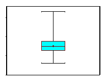
A popular graphical display for a continuous variable is a box-whisker plot. Outliers or extreme values can also be assessed graphically with box-whisker plots. For the subsample of n=10 Framingham participants who we considered previously we computed the following summary statistics on diastolic blood pressures:
|
Minimum: Q1: Median: Q3: Maximum: |
62 64 71 77 81 |
These are sometimes referred to as quantiles or percentiles of the distribution. A specific quantile or percentile is a value in the data set that holds a specific percentage of the values at or below it. The first quartile, for example, is the 25th percentile meaning that it holds 25% of the values at or below it. The median is the 50th percentile, the third quartile is the 75th percentile and the maximum is the 100th percentile (i.e., 100% of the values are at or below it).
A box-whisker plot is a graphical display of these percentiles. Figure 11 is a box-whisker plot of the diastolic blood pressures measured in the subsample of n=10 participants described above in Table 14. The horizontal lines represent (from the top) the maximum, the third quartile, the median (also indicated by the dot), the first quartile and the minimum. The shaded box represents the middle 50% of the distribution (between the first and third quartiles). A box-whisker plot is meant to convey the distribution of a variable at a quick glance. We determined that there were no outliers in the distribution of diastolic blood pressures in the subsample of n=10 participants who attended the seventh examination of the Framingham Offspring Study.
Figure 11 - Box-Whisker Plot of Diastolic Blood Pressures in Subsample of n=10.
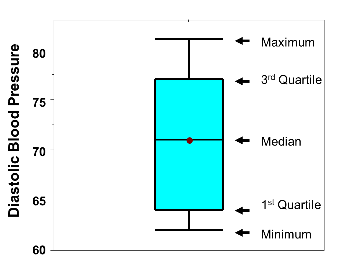
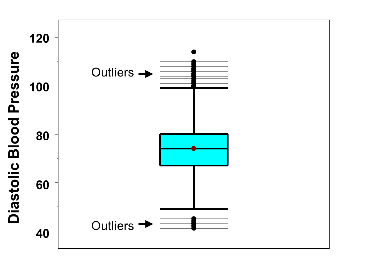
Figure 12 is a box-whisker plot of the diastolic blood pressures measured in the full sample (n=3,539) of participants. Recall that in the full sample we determined that there were outliers both at the low and the high end (See Table 16). In Figure 12 the outliers are displayed as horizontal lines at the top and bottom of the distribution. At the low end of the distribution, there are 5 values that are considered outliers (i.e., values below 47.5 which was the lower limit for determining outliers). At the high end of the distribution, there are 12 values that are considered outliers (i.e., values above 99.5 which was the upper limit for determining outliers). The "whiskers" of the plot (boldfaced horizontal brackets) are the limits we determined for detecting outliers (47.5 and 99.5).
Figure 12 - Box-Whisker Plot of Diastolic Blood Pressures with Full Sample (n=3,539) of Participants
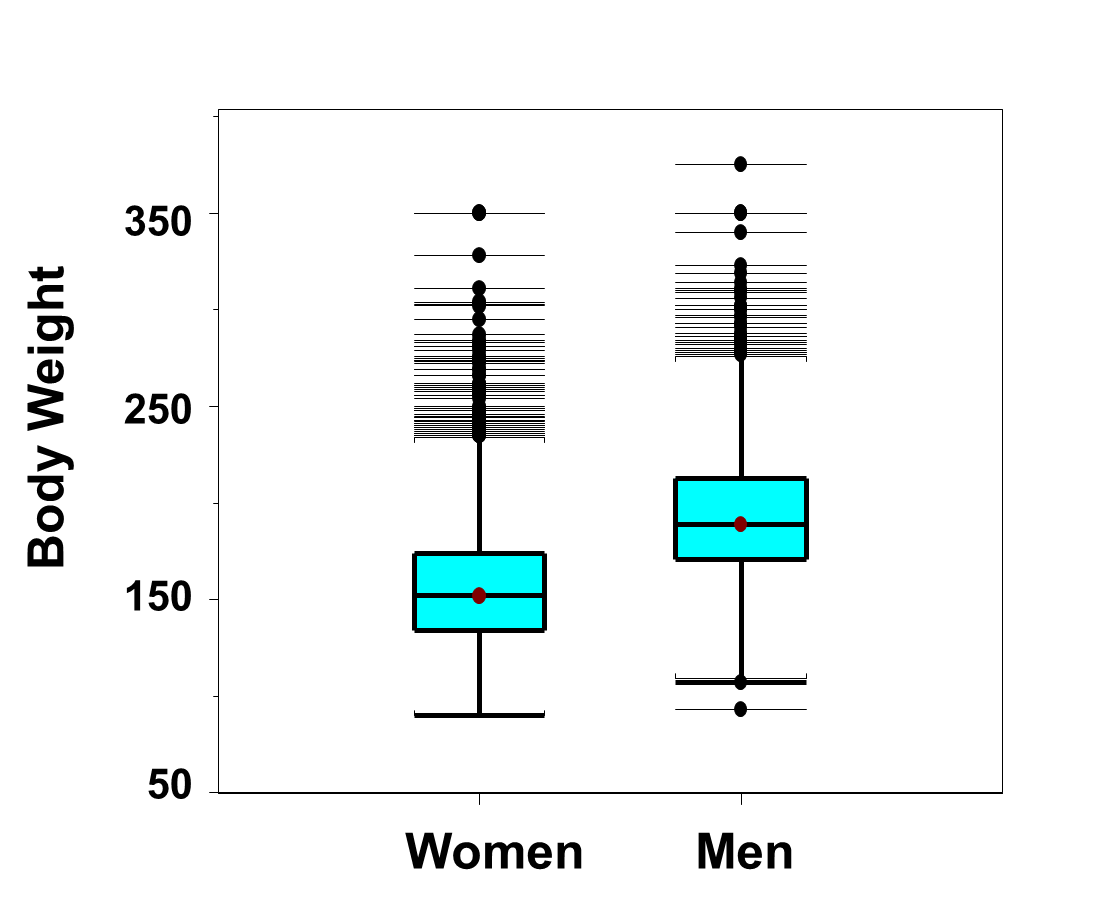
Box-whisker plots are very useful for comparing distributions. Figure 13 below shows side-by-side box-whisker plots of the distributions of weights, in pounds, for men and women in the Framingham Offspring Study. The figure clearly shows a shift in the distributions with men having much higher weights. In fact, the 25th percentile of the weights in men is approximately 180 pounds and equal to the 75th percentile in women. Specifically, 25% of the men weigh 180 or less as compared to 75% of the women. There are many outliers at the high end of the distribution among both men and women. There are two outlying low values among men.
Figure 13 - Side-by-Side Box-Whisker Plots of Weights in Men and Women in the Framingham Offspring Study
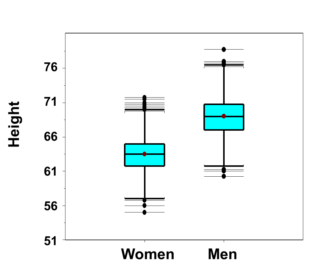
Because men are generally taller than women (see Figure 14 below), it is not surprising that men have higher weights than women.
Figure 14 - Side-by-Side Box-Whisker Plots of Heights in Men and Women in the Framingham Offspring Study
Because men are taller, a more appropriate comparison is of body mass index, see Figure 15 below.
Figure 15 - Side-by-Side Box-Whisker Plots of Body Mass Index in Men and Women in the Framingham Offspring Study
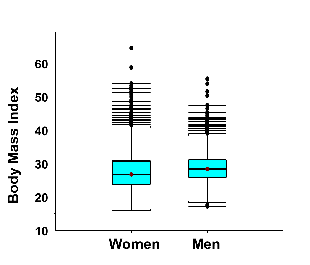
The distributions of body mass index are similar for men and women. There are again many outliers in the distributions in both men and women. However, when taking height into account (by comparing body mass index instead of comparing weights alone), we see that the most extreme outliers are among the women.
In the box-whisker plots, outliers are values which either exceed Q3 + 1.5 IQR or fall below Q1- 1.5 IQR. Some statistical computing packages use the following to determine outliers: values which either exceed Q3 + 3 IQR or fall below Q1- 3 IQR, which would result in fewer observations being classified as outliers.7,8 The rule using 1.5 IQR is the more commonly applied rule to determine outliers.
The first important aspect of any statistical analysis is an appropriate summary of the key analytic variables. This involves first identifying the type of variable being analyzed. This step is extremely important as the appropriate numerical and graphical summaries depend on the type of variable being analyzed. Variables are dichotomous, ordinal, categorical or continuous. The best numerical summaries for dichotomous, ordinal and categorical variables involve relative frequencies. The best numerical summaries for continuous variables include the mean and standard deviation or the median and interquartile range, depending on whether or not there are outliers in the distribution. The mean and standard deviation or the median and interquartile range summarize central tendency (also called location) and dispersion, respectively. The best graphical summary for dichotomous and categorical variables is a bar chart and the best graphical summary for an ordinal variable is a histogram. Both bar charts and histograms can be designed to display frequencies or relative frequencies, with the latter being the more popular display. Box-whisker plots provide a very useful and informative summary for continuous variables. Box-whisker plots are also useful for comparing the distributions of a continuous variable among mutually exclusive (i.e., non-overlapping) comparison groups.
The following table summarizes key statistics and graphical displays organized by variable type.
|
Variable Type |
Statistic |
Definition |
|---|---|---|
|
Dichotomous, Ordinal or Categorical |
Relative Frequency |
f/n |
|
Dichotomous or Categorical |
Frequency or Relative Frequency Bar Chart |
|
|
Frequency or Relative Frequency Histogram |
|
|
Continuous |
Mean |
|
|
Standard Deviation |
|
|
|
Median |
Middle value in ordered data set |
|
|
First Quartile
Third Quartile |
Q1=Value holding 25% at or below it Q3=Value holding 25% at or above it |
|
|
Interquartile Range |
Q3- Q1 |
|
|
Criteria for Outliers |
Values below Q1-1.5(Q3-Q1) or above Q3+1.5(Q3-Q1) |
|
|
Box-Whisker Plot |
|